Using Network Analysis to Analyze The China Biographical Dataset
Author
prAxIs UBC Team Alex Ronczewski
Published
13 October 2025
0.0 Prerequisites
SOCI 415 Network Analysis Intro Notebook
Kinmatrix Dataset Notebook
The China Biographical Database is a freely accessible relational database with biographical information about approximately 641,568 individuals as of August 2024, currently mainly from the 7th through 19th centuries. It was developed as a collaborative project between scholars at Harvard University, Academia Sinica, and Peking University. The data is useful for statistical, social network, and spatial analysis as well as serving as a biographical reference for Chinese History. It enables quantitative exploration of real Chinese history.
The CBDB dataset is considerably more extensive and complex than the KINMATRIX dataset from the previous notebook. The KINMATRIX dataset we used previously contained ego-centric networks: networks centered around specific individuals showing their personal connections. CBDB represents a sociocentric network: a complete network showing connections among all members of a social system.
This change allows for more complex and realistic studies of network structure like community detection, and macro-social patterns. If you wish to read more about the structure of the dataset you can follow the link Structure of CBDB. This dataset will be ideal for more realistic family network exploration.
Learning Objectives: In this notebook students will learn about:
Gain an increased understanding of general network analysis in Python and how to manipulate data
Apply community detection algorithms to identify subgroups in historical networks
Calculate and interpret multiple centrality measures to identify influential historical figures
Analyze gender differences in network positions using statistical methods
Examine temporal changes in network structure across Chinese dynasties
Connect network analysis findings to broader sociological theories about social structure and power
1.0 Data Loading and Intro
As with all of our notebooks so far we will begin with loading all of our libraries. This library list is similar to the one used in the KINMATRIX data analysis.
Show the code
#Libraries listed belowimport sqlite3import pandas as pdimport networkx as nx #Our Python network analysis libraryimport matplotlib.pyplot as pltimport matplotlib.patches as mpatchesimport matplotlib.cm as cmimport randomfrom community import community_louvainimport numpy as npfrom collections import Counterfrom pyvis.network import Networkfrom scipy import statsimport seaborn as snsfrom collections import OrderedDictfrom tabulate import tabulate
Now that we have all of the libraries loaded in for our analysis we can load our data. The dataset is a .db file; it is a database. The CBDB data is extensive and has lots of variables within it, in order to access them we have to choose a table from our .db file. A table is a structured collection of data organized in rows and columns, similar to a spreadsheet. Each table contains records (rows), and every record has fields (columns). This is different from the KINMATRIX dataset which used a .dta file. The main difference students should be aware of is that we will have to select the table before selecting the variables. In the KINMATRIX data we could just list all variables from the start. For .db files there is one more step.
Display all of the tables in the dataset .db file.
Show the code
db_path =r'datasets\latest.db'#pathconn = sqlite3.connect(db_path)cursor = conn.cursor()# List all tablescursor.execute("SELECT name FROM sqlite_master WHERE type='table';")tables = cursor.fetchall()print("Tables in database:", tables)conn.close()
The output of the cell above is a list of all of the tables in the dataset and we can see that the list is extensive. The one we are most interested in is called KIN_DATA. Inside of this table we have information on node (Person ID), and edges (Kin Code). These variables will serve as the foundation for our analysis. We will now load the table. The output of this cell will be all of the variables within the table ‘KIN_DATA.’
Show the code
# Connect to the databaseconn = sqlite3.connect(db_path)df = pd.read_sql_query("SELECT * FROM KIN_DATA", conn)# Show the first few rowsprint(df.head())conn.close()
We can see from the output that the table contains both English and Chinese variables so we will have to be careful to select the English language variables. We have now loaded the correct data and just like with the KINMATRIX Dataset we will build a NetworkX Graph and print the number of nodes and edges. Using the Person ID and Kin ID variables we will create a graph with nodes and edges.
Show the code
# Create an empty graphG = nx.Graph()# Add edges with kinship type as edge attributefor _, row in df.iterrows(): person = row['c_personid'] kin = row['c_kin_id'] kin_type = row['c_kin_code'] G.add_edge(person, kin, kinship=kin_type)print(f"Number of nodes: {G.number_of_nodes()}")print(f"Number of edges: {G.number_of_edges()}")
Number of nodes: 278262
Number of edges: 272717
We have over 278,000 nodes and a similar amount of edges. This is a far bigger dataset than we have previously used. This is a very extensive dataset where one of these networks is larger than all of the networks for the KINMATRIX Dataset.
Note
The size of the network presents us with both amazing opportunities and challenges. We can study macro-level patterns impossible to see in smaller networks, but we must be very careful when choosing analytical methods to not run into computational problems. Because of this we will not be able to visualize this full network, later in the notebook we will find a way to visualize smaller subsets analogous to countries and regions in the KINMATRIX Dataset.
2.0 Louvain and Community Clusters
The first thing we will do for our analysis is look for are smaller sub-groups. This is analysis we could not do for the KINMATRIX Dataset as it was an ego-centric network. This is very popular technique in network analysis as it helps uncover hidden group structure in very expansive and complex networks. Sociologists have long recognized that large social systems organize into meaningful subgroups and being familiar with this analysis is a major benefit. The reasons for this clustering is often less apparent and knowledge of the data or in this case Chinese History is necessary. Reasons for clustering can range from geographical (remote communities behind natural barriers), temporal (individuals from the same time period or dynasty), status/social rank or in the case of UBC students similar interests (clubs) or majors.
In our case large networks (like the CBDB) can be overwhelming and computationally intensive to study. Unlike the KINMATRIX dataset where the data was naturally divided into countries and provinces there are far less clear subgroups in this dataset. By identifying clusters, sociologists can summarize, visualize, and understand the major subgroups and their relationships, making the network more interpretable. To perform this community analysis we will need to introduce some more terminology.
Cohesive subgroups in network analysis refer to clusters of nodes within a network that are more densely connected to each other than to the rest of the network. These subgroups indicate areas of high interaction or strong relationships within the larger network. Identifying cohesive subgroups helps in understanding the structure and dynamics of the network, such as how information or influence flows within and between these groups. The process of finding cohesive subgroups within networks is called cohesive group analysis.
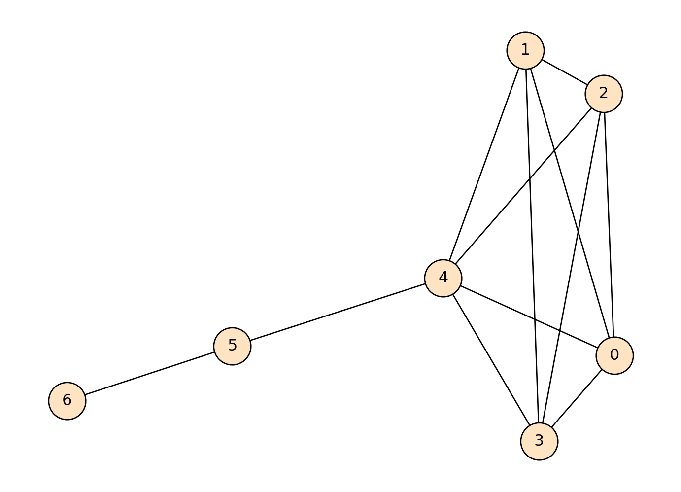
A clique is a subset of nodes within a graph where every node is directly connected to every other node in the subset. This means that in a clique, all possible edges between the nodes are present, making it a maximally connected subgraph. All nodes are that are by themselves are inherently a clique (a 1-clique). While cliques represent perfect connection (everyone connected to everyone), real social groups rarely achieve this ideal.
Let’s see what this looks like on an example network before moving towards our real data.
Show the code
#Create our networkG_cliques_example = nx.Graph()edges_list = [(0,1),(0,2),(0,3),(0,4),(1,2),(2,3),(3,4),(1,4),(2,4),(1,3),(4,5),(5,6)]G_cliques_example.add_edges_from(edges_list)pos = nx.spring_layout(G_cliques_example, seed=1000)#Find our cliques and print where they arecliques = [x for x in nx.find_cliques(G_cliques_example)]print(cliques)#Draw our graph nx.draw(G_cliques_example,pos=pos, with_labels=True, edgecolors="black", node_color ="bisque", node_size=800)
[[4, 0, 1, 2, 3], [4, 5], [6, 5]]
We can see that there are three cliques in this network: \((4, 0, 1, 2, 3)\), \((4, 5)\), and \((6, 5)\):
We can colour them green to be more easily identifiable.
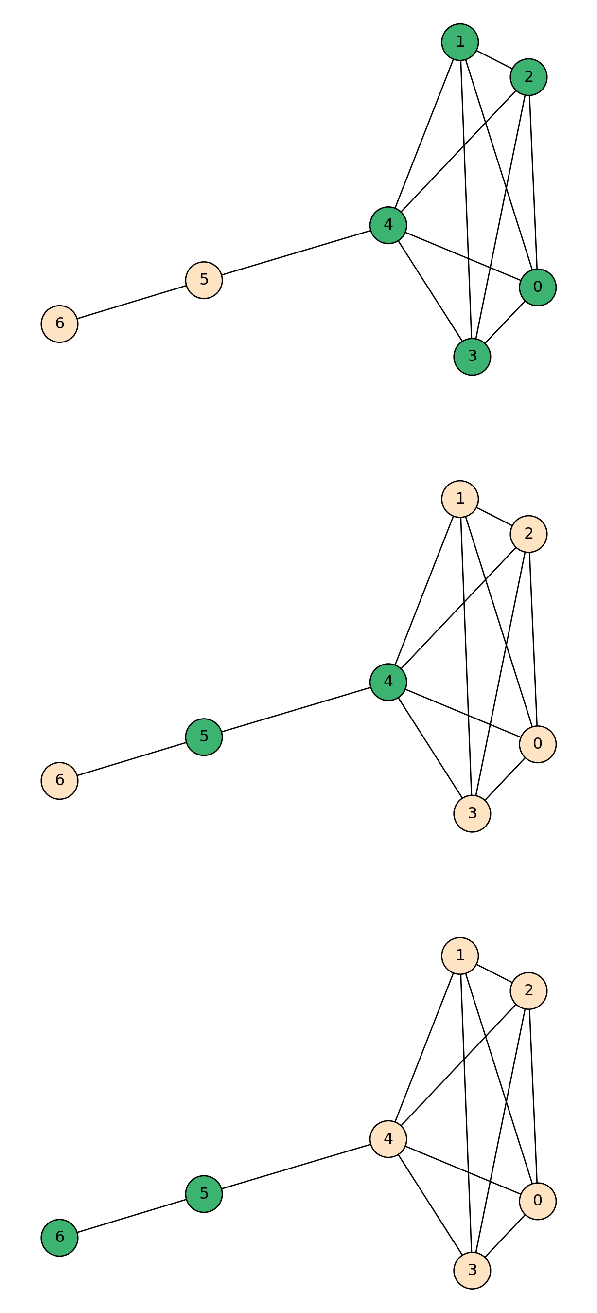
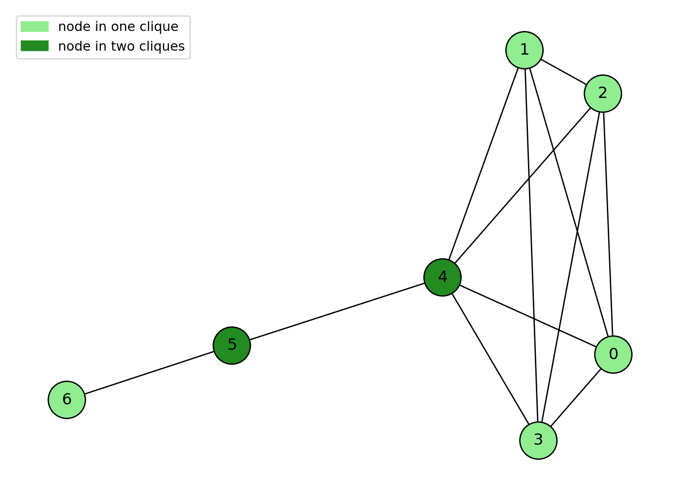
It is also important to note that nodes can also be in multiple cliques. Just like in real life you can be in multiple social groups or clubs. It might be of interest to see which nodes are in the most cliques and we will do this by coloring our node with different shades of green.
Show the code
#Create our example graphG_cliques_example = nx.Graph()edges_list = [(0,1),(0,2),(0,3),(0,4),(1,2),(2,3),(3,4),(1,4),(2,4),(1,3),(4,5),(5,6)]G_cliques_example.add_edges_from(edges_list)pos = nx.spring_layout(G_cliques_example, seed=1000)#Find the cliquescliques = [x for x in nx.find_cliques(G_cliques_example)]print(cliques)#For loopnode_counts = {}for clique in cliques: #for each clique in the list of cliques...for node in clique: # for each node in each clique...if node in node_counts: #checks whether the current node already exists as a key in the node_counts dictionary node_counts[node] +=1#if it is in the dictionary, increase its value by 1else: node_counts[node] =1#if it isn't, dont change#Colour our nodescolors = []for node in G_cliques_example.nodes():if node_counts[node] ==1: colors.append("lightgreen")elif node_counts[node] ==2: colors.append("forestgreen")elif node_counts[node] ==3: colors.append("orange")else: colors.append("red")#Draw our network nx.draw(G_cliques_example,pos=pos, with_labels=True, edgecolors="black", node_color = colors, node_size=800)patch_green = mpatches.Patch(color='lightgreen', label='node in one clique') patch_forest = mpatches.Patch(color='forestgreen', label='node in two cliques') plt.legend(handles=[patch_green, patch_forest])plt.show()
[[4, 0, 1, 2, 3], [4, 5], [6, 5]]
2.1 Network-level analysis: Clusters and clustering coefficients
A cluster (also known as a community) is a set of nodes in a graph that are densely connected to each other but sparsely connected to nodes in other clusters. For example, in a social network, a cluster might represent a group of people who frequently interact with each other but have fewer interactions with people outside the group. Community detection is the process of finding such communities within nodes.
Before diving into community detection, we first need to understand modularity. Modularity is a numerical measure for the community structure of a graph: it compares the density of edges within the communities of a network to the density of edges between communities. A positive modularity value suggests a strong community structure, while values closer to zero or negative indicate that the divisions are no better than random.
The Louvain algorithm is a community detection method in networks that aims to optimize modularity. By optimizing modularity, the Louvain algorithm effectively uncovers natural divisions in the network where connections are dense within clusters and sparse between them, thus identifying meaningful community structures. This algorithm mimics how social groups might naturally form and dissolve over time.
A less technical description of this algorithm’s logic:
Each node initially forms their own ‘community’
People ‘join’ neighboring communities if it improves overall modularity
Sub-groups that emerged are treated as single nodes
Process repeats until no further improvements possible
The result is a final set of communities that maximize modularity in the network.
Note
It is worth knowing that because of the nature of the Louvain Algorithm every time it is run it might lead to slightly different outcomes especially in expansive networks like the CBDB we are using. Variations in the processing order of nodes can lead to different results with each run, it’s modularity-optimizing approach can fail to detect small communities or create poorly connected groups.
Let’s first try running the Louvain Algorithm on a random graph to demonstrate how it works before running it on our real data.
Show the code
#Set the seed so it is reproduciblerandom.seed(1)n =20# number of nodesd =3# degree of each node# Generate the random regular graphrr_graph = nx.random_regular_graph(d, n)partition = community_louvain.best_partition(rr_graph)pos = nx.spring_layout(rr_graph, seed=42)num_communities =max(partition.values()) +1cmap = cm.get_cmap('viridis', num_communities)nx.draw_networkx_nodes( rr_graph, pos, node_size=40, cmap=cmap, node_color=list(partition.values()))nx.draw_networkx_edges(rr_graph, pos, alpha=0.5)plt.show()
C:\Users\alexr\AppData\Local\Temp\ipykernel_2036\1466713553.py:13: MatplotlibDeprecationWarning:

The get_cmap function was deprecated in Matplotlib 3.7 and will be removed in 3.11. Use ``matplotlib.colormaps[name]`` or ``matplotlib.colormaps.get_cmap()`` or ``pyplot.get_cmap()`` instead.
We can see by the node coloring that by optimizing modularity the Louvain Algorithm has found smaller subgroups within our random network. Now we can try it on our real data.
2.2 Louvain Run on our Real Data
As with before we will set a random seed so that the analysis is reproducible. We will also print out average community size along with the size of the largest and smallest communities. We will also print the top 10 largest communities and their sizes.
We will also be working with the largest connected component for this analysis as using the whole network will be too computationally intensive.
Show the code
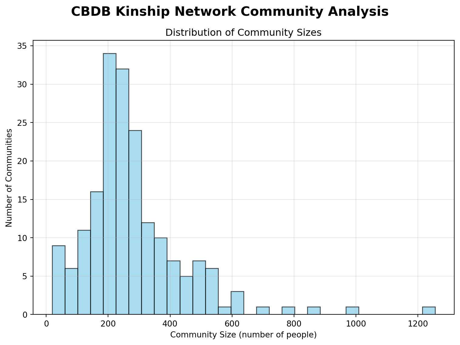
#Set a seed for reproducability of our resultsnp.random.seed(1)# Load kinship data into DataFrameconn = sqlite3.connect(db_path)df = pd.read_sql_query("SELECT c_personid, c_kin_id, c_kin_code FROM KIN_DATA", conn)conn.close()# Build the GraphG = nx.Graph()for _, row in df.iterrows(): person = row['c_personid'] kin = row['c_kin_id'] kin_type = row['c_kin_code'] G.add_edge(person, kin, kinship=kin_type)# Work with the largest connected componentlargest_cc =max(nx.connected_components(G), key=len)G_sub = G.subgraph(largest_cc).copy()print(f"Largest connected component nodes: {G_sub.number_of_nodes()}")# Run Louvain Community Detectionpartition = community_louvain.best_partition(G_sub)# Community Analysis Outputnum_communities =len(set(partition.values()))print(f"In our data Louvain has detected {num_communities} communities.")# Count community sizescommunity_sizes = Counter(partition.values())print(f"\nMetrics about Community size:")print(f"Average community size: {np.mean(list(community_sizes.values())):.1f}")print(f"Largest community: {max(community_sizes.values())} people")print(f"Smallest community: {min(community_sizes.values())} people")#Show top 10 largest communitiesprint(f"\nLargest Communities:")for i, (comm_id, size) inenumerate(community_sizes.most_common(10)):print(f"Community {comm_id}: {size:,} people")# Calculate modularitymodularity = community_louvain.modularity(partition, G_sub)print(f"\nModularity Score: {modularity:.4f}")print("(Higher modularity indicates stronger community structure)")#Distribution Histogram of Community Sizefig, ax = plt.subplots(figsize=(8, 6))fig.suptitle('CBDB Kinship Network Community Analysis', fontsize=16, fontweight='bold')# Community size histogramax.hist(list(community_sizes.values()), bins=30, alpha=0.7, color='skyblue', edgecolor='black')ax.set_xlabel('Community Size (number of people)')ax.set_ylabel('Number of Communities')ax.set_title('Distribution of Community Sizes')ax.grid(True, alpha=0.3)plt.tight_layout()plt.show()
Largest connected component nodes: 52992
In our data Louvain has detected 188 communities.

Metrics about Community size:
Average community size: 281.9
Largest community: 1256 people
Smallest community: 19 people

Largest Communities:
Community 46: 1,256 people
Community 124: 995 people
Community 48: 873 people
Community 126: 801 people
Community 4: 682 people
Community 34: 621 people
Community 18: 617 people
Community 145: 606 people
Community 90: 563 people
Community 109: 528 people

Modularity Score: 0.9604
(Higher modularity indicates stronger community structure)
From the visualization we can see most communities are around 200 - 400 nodes in size.
Let’s look at two of these communities in more detail, we will look at one average sized one and one large one. We can compare these communities to the ones in the KINMATRIX Dataset. Pay attention and look for differences.
The two we will use are:
Community 20: 703 nodes with 940 edges
Community 125: 308 nodes with 392 edges
Show the code
np.random.seed(1)def visualize_cbdb_community(G_sub, partition, community_id, max_nodes=1000): community_nodes = [str(node) for node, comm_id in partition.items() if comm_id == community_id]print(f"Community {community_id}: {len(community_nodes)} people")# Create subgraph with string node IDs subgraph = G_sub.subgraph([int(node) for node in community_nodes])print(f"Showing {len(community_nodes)} people, {subgraph.number_of_edges()} relationships") net = Network(height="700px", width="100%", bgcolor="#ffffff", notebook=True)for node in community_nodes: degree = subgraph.degree[int(node)] size =max(15, min(35, 15+ degree)) net.add_node(str(node), label=str(node), size=size, color="#3498db", title=f"Person {node}\nConnections: {degree}")for u, v, data in subgraph.edges(data=True): net.add_edge(str(u), str(v), color="#cccccc", title=f"Kinship: {data.get('kinship','family')}") filename =f"community_{community_id}.html" net.show(filename)print(f"Interactive network: {filename}")#Run the functionvisualize_cbdb_community(G_sub, partition, 20)visualize_cbdb_community(G_sub, partition, 125)
Community 20: 267 people
Showing 267 people, 325 relationships
Warning: When  cdn_resources is 'local' jupyter notebook has issues displaying graphics on chrome/safari. Use cdn_resources='in_line' or cdn_resources='remote' if you have issues viewing graphics in a notebook.
community_20.html
Interactive network: community_20.html
Community 125: 305 people
Showing 305 people, 328 relationships
Warning: When  cdn_resources is 'local' jupyter notebook has issues displaying graphics on chrome/safari. Use cdn_resources='in_line' or cdn_resources='remote' if you have issues viewing graphics in a notebook.
community_125.html
Interactive network: community_125.html
We will again use a PyVis visualization, just like with the KINMATRIX Visualizations we can zoom and pan around and hover on the nodes. This time you can also drag the nodes and the surrounding nodes will move like bacteria under a microscope.
2.3 Macro Stats and Dynasties
To get a better understanding of our communities we will look at some summary statistics. Let’s briefly define what these summary statistics will be:
Diameter: The longest shortest path between any two nodes in the network or component. This is a way to measure how “wide” our network is.
Average Path Length: The average number of steps along the shortest paths for all possible pairs of nodes in the graph
Average Clustering: The likelihood that any two neighbors of a node are also connected to each other. Higher values mean people in the community tend to form “groups”.
We will also look at degree centrality, density and number of nodes. These will allow us to quantitatively describe our communities.
Show the code
np.random.seed(1)def macro_stats(G_sub, partition, community_id): nodes = [n for n, c in partition.items() if c == community_id] subg = G_sub.subgraph(nodes) stats = {}if nx.is_connected(subg): stats['diameter'] = nx.diameter(subg) stats['avg_path_length'] = nx.average_shortest_path_length(subg)else:# statistics of largest connected component only lcc = subg.subgraph(max(nx.connected_components(subg), key=len)) stats['diameter'] = nx.diameter(lcc) stats['avg_path_length'] = nx.average_shortest_path_length(lcc) degrees =dict(subg.degree()) max_degree =max(degrees.values()) n =len(degrees)if n >1: degree_centralization =sum(max_degree - d for d in degrees.values()) / ((n-1)*(n-2))else: degree_centralization =0 stats['degree_centralization'] = degree_centralization stats['avg_clustering'] = nx.average_clustering(subg) stats['density'] = nx.density(subg) stats['n_nodes'] = nreturn stats#Print:stats_20 = macro_stats(G_sub, partition, 20)stats_125 = macro_stats(G_sub, partition, 125)community_stats = [ ['20'] + [stats_20[k] for k in stats_20], ['125'] + [stats_125[k] for k in stats_125]]headers = ['Community'] +list(stats_20.keys())print(tabulate(community_stats, headers=headers, tablefmt='fancy_grid', floatfmt=".6f"))
We now have more quantifiable metrics for our visualizations. Let’s continue our analysis with finding which dynasties these communities are primarily from. Every node in this dataset is a real person in Chinese history so it will be very interesting to see who these people are.
Show the code
np.random.seed(1)# Community 125personids_125 = [n for n, c in partition.items() if c ==125]conn = sqlite3.connect(db_path)if personids_125: query_125 =f''' SELECT c_personid, c_dy FROM BIOG_MAIN WHERE c_personid IN ({','.join(['?']*len(personids_125))}) ''' df_dyn_125 = pd.read_sql_query(query_125, conn, params=personids_125)else: df_dyn_125 = pd.DataFrame(columns=['c_personid', 'c_dy'])# Community 20personids_20 = [n for n, c in partition.items() if c ==20]if personids_20: query_20 =f''' SELECT c_personid, c_dy FROM BIOG_MAIN WHERE c_personid IN ({','.join(['?']*len(personids_20))}) ''' df_dyn_20 = pd.read_sql_query(query_20, conn, params=personids_20)else: df_dyn_20 = pd.DataFrame(columns=['c_personid', 'c_dy'])conn.close()# Show the most common dynasty codesprint("Community 125 dominant dynasties:")print(df_dyn_125['c_dy'].value_counts().head(3))print("Community 20 dominant dynasties:")print(df_dyn_20['c_dy'].value_counts().head(3))
Community 125 dominant dynasties:
Series([], Name: count, dtype: int64)
Community 20 dominant dynasties:
Series([], Name: count, dtype: int64)
We can see that Community 125 is primarily from Dynasty 6, and Community 20 is primarily from Dynasty 15, but this does not tell us much we need to translate 6 and 15 into real dynasty names. These values represent names of real dynasties, but without the key this output does not mean anything.
Let’s now map these values to real dynasty names. We will do this by looking at the c_dynasty and c_dy variables which represents real dynasty names.
Show the code
np.random.seed(1)conn = sqlite3.connect(db_path)dynasty_mapping = pd.read_sql_query('SELECT c_dy, c_dynasty FROM DYNASTIES', conn)conn.close()def get_dynasty_breakdown(df_dyn, dynasty_mapping): df_merged = df_dyn.merge(dynasty_mapping, on='c_dy', how='left')return df_merged['c_dynasty'].value_counts() print("Community 125 top 3 dynasties:")print(get_dynasty_breakdown(df_dyn_125, dynasty_mapping).head(3))print("Community 20 top 3 dynasties:")print(get_dynasty_breakdown(df_dyn_20, dynasty_mapping).head(3))
Community 125 top 3 dynasties:
Series([], Name: count, dtype: int64)
Community 20 top 3 dynasties:
Series([], Name: count, dtype: int64)
Now we know that Community 125 is primarily made up of individuals from the Tang Dynasty and Community 20 is primarily made up of individuals from the Song Dynasty.
2.4 Coloring Nodes
Like with the KINMATRIX Dataset we will color our Pyvis visualizations by a variable of interest. In this case we will color Community 125 by gender where male is purple and women are yellow. There are no unknown gender variables in either of these communities so we can just have two colors in our color map.
Show the code
np.random.seed(1)# Get all node and person id'sall_personids =list(set([n for n in partition.keys()]))conn = sqlite3.connect(db_path)query =f''' SELECT c_personid, c_female FROM BIOG_MAIN WHERE c_personid IN ({','.join(str(pid) for pid in all_personids)})'''df_gender = pd.read_sql_query(query, conn)conn.close()# Function to map female/male from number 1/0def sex_label(val):return'female'if val ==1else ('male'if val ==0else'unknown')gender_dict = {row['c_personid']: sex_label(row['c_female']) for _, row in df_gender.iterrows()}def visualize_cbdb_community_gender(G_sub, partition, community_id, gender_dict, max_nodes=1000): community_nodes = [str(node) for node, comm_id in partition.items() if comm_id == community_id]print(f"Community {community_id}: {len(community_nodes)} people")iflen(community_nodes) > max_nodes:print(f"Sampling {max_nodes} nodes for performance...") subgraph_full = G_sub.subgraph([int(node) for node in community_nodes]) degrees =dict(subgraph_full.degree()) sorted_nodes =sorted(community_nodes, key=lambda x: degrees.get(int(x), 0), reverse=True) community_nodes = sorted_nodes[:max_nodes//2] + random.sample(sorted_nodes[max_nodes//2:], max_nodes//2) subgraph = G_sub.subgraph([int(node) for node in community_nodes])print(f"Showing {len(community_nodes)} people, {subgraph.number_of_edges()} relationships") net = Network(height="700px", width="100%", bgcolor="#ffffff", notebook=True) color_map = {'male': '#800080', # purple'female': '#FFFF00'} # yellow for node in community_nodes: gender = gender_dict.get(int(node), 'unknown') degree = subgraph.degree[int(node)] size =max(15, min(35, 15+ degree)) net.add_node(str(node), label=str(node), size=size, color=color_map.get(gender, '#bdbdbd'), title=f"Person {node}\nConnections: {degree}\nGender: {gender}")for u, v, data in subgraph.edges(data=True): net.add_edge(str(u), str(v), color="#cccccc", title=f"Kinship: {data.get('kinship','family')}") filename =f"community_{community_id}_gender.html" net.show(filename)print(f"Interactive network: {filename}")visualize_cbdb_community_gender(G_sub, partition, 125, gender_dict)
Community 125: 305 people
Showing 305 people, 328 relationships
Warning: When  cdn_resources is 'local' jupyter notebook has issues displaying graphics on chrome/safari. Use cdn_resources='in_line' or cdn_resources='remote' if you have issues viewing graphics in a notebook.
community_125_gender.html
Interactive network: community_125_gender.html
We can see that most of the nodes are male, especially the most central nodes, we will come back to this later, but think about why that is? Continuing on with the notion of centrality lets color the nodes in Community 20 with a color gradient where the nodes with the lowest degree centrality will be blue and the node with the highest will be red. This will serve as an intuitive method to visualize degree centrality.
Show the code
np.random.seed(1)def visualize_cbdb_community_degree(G_sub, partition, community_id, max_nodes=1000): community_nodes = [str(node) for node, comm_id in partition.items() if comm_id == community_id]print(f"Community {community_id}: {len(community_nodes)} people") subgraph = G_sub.subgraph([int(node) for node in community_nodes])print(f"Showing {len(community_nodes)} people, {subgraph.number_of_edges()} relationships") net = Network(height="700px", width="100%", bgcolor="#ffffff", notebook=True) degrees =dict(subgraph.degree()) deg_values = [degrees[int(node)] for node in community_nodes] min_deg, max_deg =min(deg_values), max(deg_values) norm = plt.Normalize(min_deg, max_deg) cmap = plt.get_cmap('coolwarm') for node in community_nodes: degree = degrees[int(node)] size =max(15, min(35, 15+ degree)) rgb_vals = cmap(norm(degree))[:3] hex_color ='#%02x%02x%02x'%tuple(int(x*255) for x in rgb_vals) net.add_node(str(node), label=str(node), size=size, color=hex_color, title=f"Person {node}\nConnections: {degree}")for u, v, data in subgraph.edges(data=True): net.add_edge(str(u), str(v), color="#cccccc", title=f"Kinship: {data.get('kinship','family')}") filename =f"community_{community_id}_degree.html" net.show(filename)print(f"Interactive network: {filename}")print(f"Color gradient: low degree (blue) to high degree (red).")visualize_cbdb_community_degree(G_sub, partition, 20)
Community 20: 267 people
Showing 267 people, 325 relationships
Warning: When  cdn_resources is 'local' jupyter notebook has issues displaying graphics on chrome/safari. Use cdn_resources='in_line' or cdn_resources='remote' if you have issues viewing graphics in a notebook.
community_20_degree.html
Interactive network: community_20_degree.html
Color gradient: low degree (blue) to high degree (red).
This is a very intuitive way to look at centrality, the most important nodes are yellow, orange and red. They are physically at the center of our network. In the next section we will try to define this centrality more formally.
2.5 Visualization Discussion
In small groups of 3-4 look at the visualizations from this dataset and compare them to our pyVis visualizations from the KINMATRIX Dataset. Try to be specific and use the terminology introduced in the introductory notebook. How are they similar and how are they different?
3.0 Degree Centrality for Important Family Members
We can see from our community visualization that some members are more central and connect different parts of the family network. In family analysis these would be considered important connectors. In order to examine them further we will use the measures of centrality we introduced in the first notebook. Centrality measures are quantitative metrics that identify the most important or influential nodes within a network, we will do this to try and identify key historical figures and try to reveal hidden connections.
Warning
The cells below take a very long time to run, so we will leave it all commented and just have the output pasted below. They have to calculate the centrality for over 280,000 nodes individually.
Show the code
#print(f"Analyzing network with {G_sub.number_of_nodes():,} nodes and {G_sub.number_of_edges():,} edges")#degree_centrality = nx.degree_centrality(G_sub)#betweenness_centrality = nx.betweenness_centrality(G_sub, k=1000) #closeness_centrality = nx.closeness_centrality(G_sub)#eigenvector_centrality = nx.eigenvector_centrality(G_sub, max_iter=1000)
Create Centrality DataFrame and Display Statistics
Show the code
#Create a comprehensive centrality dataframe#centrality_df = pd.DataFrame({# 'person_id': list(G_sub.nodes()),# 'degree': [G_sub.degree(node) for node in G_sub.nodes()],# 'degree_centrality': [degree_centrality[node] for node in G_sub.nodes()],# 'betweenness_centrality': [betweenness_centrality[node] for node in G_sub.nodes()],# 'closeness_centrality': [closeness_centrality[node] for node in G_sub.nodes# 'eigenvector_centrality': [eigenvector_centrality[node] for node in G_sub.nodes()]#})#print("Centrality Statistics:")#print(centrality_df.describe())#print(f"\nDataFrame shape: {centrality_df.shape}")#print(f"Columns: {list(centrality_df.columns)}")
count 52992.000000 5.299200e+04
mean 0.054518 2.787520e-04
std 0.010117 4.335138e-03
min 0.024212 1.972009e-17
25% 0.047437 3.783786e-12
50% 0.054617 3.964649e-10
75% 0.061708 4.877353e-08
max 0.085383 5.227996e-01
Now we can look at the most central nodes in the dataset to try and find important individuals in the data.
In order to find these key individuals we will use our three centrality measures.
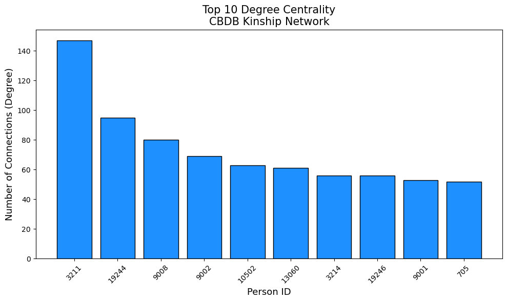
Degree Centrality: Measures how many direct connections a node (person) has. It’s the family member with the most immediate kinship ties.
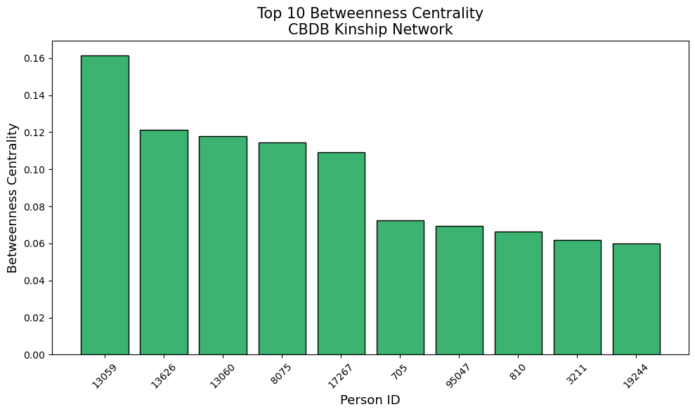
Betweenness Centrality: Captures how often a node lies on the shortest path between other nodes. It identifies family members who act as bridges, connecting separate branches or generations.
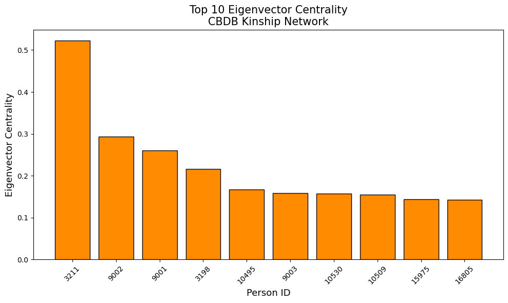
Eigenvector Centrality: Reflects not just the number of connections, but also the quality-being connected to other well-connected family members. High eigenvector centrality means the person is part of the core, influential family group for instance an emperor or very high ranking official.
Show the code
#print("Degree Centrality (Most Connected Family Members):")#top_degree = centrality_df.nlargest(10, 'degree')#for idx, row in top_degree.iterrows():# print(f"Person {row['person_id']:>8}: {row['degree']:>3} connections (centrality: {row['degree_centrality']:.4f})")#print("Betweenness Centrality (Best Family Bridges):")#top_betweenness = centrality_df.nlargest(10, 'betweenness_centrality')#for idx, row in top_betweenness.iterrows():# print(f"Person {row['person_id']:>8}: {row['betweenness_centrality']:.4f} (degree: {row['degree']:>3})")#print("Eigenvector Centrality (Most Influential Family Connections):")#top_eigenvector = centrality_df.nlargest(10, 'eigenvector_centrality')#for idx, row in top_eigenvector.iterrows():# print(f"Person {row['person_id']:>8}: {row['eigenvector_centrality']:.4f} (degree: {row['degree']:>3})")
Output: Degree Centrality (Most Connected Family Members): Person 3211.0: 147.0 connections (centrality: 0.0028) Person 19244.0: 95.0 connections (centrality: 0.0018) Person 9008.0: 80.0 connections (centrality: 0.0015) Person 9002.0: 69.0 connections (centrality: 0.0013) Person 10502.0: 63.0 connections (centrality: 0.0012) Person 13060.0: 61.0 connections (centrality: 0.0012) Person 3214.0: 56.0 connections (centrality: 0.0011) Person 19246.0: 56.0 connections (centrality: 0.0011) Person 9001.0: 53.0 connections (centrality: 0.0010) Person 705.0: 52.0 connections (centrality: 0.0010)
Betweenness Centrality (Best Family Bridges): Person 13059.0: 0.1588 (degree: 49.0) Person 13626.0: 0.1217 (degree: 14.0) Person 13060.0: 0.1147 (degree: 61.0) Person 8075.0: 0.1137 (degree: 29.0) Person 17267.0: 0.1092 (degree: 4.0) Person 705.0: 0.0717 (degree: 52.0) Person 95047.0: 0.0713 (degree: 10.0) Person 810.0: 0.0685 (degree: 7.0) Person 19244.0: 0.0609 (degree: 95.0) Person 3211.0: 0.0604 (degree: 147.0)
Eigenvector Centrality (Most Influential Family Connections): Person 3211.0: 0.5228 (degree: 147.0) Person 9002.0: 0.2929 (degree: 69.0) Person 9001.0: 0.2602 (degree: 53.0) Person 3198.0: 0.2168 (degree: 28.0) Person 10495.0: 0.1676 (degree: 23.0) Person 9003.0: 0.1582 (degree: 35.0) Person 10530.0: 0.1571 (degree: 15.0) Person 10509.0: 0.1546 (degree: 11.0) Person 15975.0: 0.1437 (degree: 11.0) Person 16805.0: 0.1421 (degree: 19.0)
Analysis
Let’s look at our three types of centrality from before and use them to order our most important individuals.
Degree Centrality: These are the family members with the most direct kinship ties.
Betweenness Centrality: These family members connect different branches/generations
Eigenvector Centrality: These are connected to other highly connected family members
Below are three graphs plotting our output for most central individuals.
Degree Centrality
Betweenness Centrality
Eigenvector Centrality
Person 3211 emerges as the most connected individual with 147 kinship ties, nearly 50% more than the second-most connected person (Person 19244 with 95 connections). This level of connectivity suggests Person 3211 likely represents either a major family patriarch who lived an exceptionally long life, accumulated multiple marriages and offspring, or potentially a family line that was consolidated under a single record. He will most likely be a very important figure in Chinese History. Person 3211 dominates this measure with a score of 0.5228, more than double the second-highest individual (Person 9002 with 0.2929). This indicates that Person 3211 is not only highly connected but also connected to other highly connected families, representing the apex of elite Chinese society.
Even more striking is Person 17267, who achieves a betweenness centrality of 0.1092 with only 4 direct connections. This individual represents what network analysts call a “critical bridge” - someone whose position in the network gives them disproportionate influence over information flow and family interactions. In historical Chinese context, such individuals likely played crucial roles connecting large families like an emperor or emperor’s wife.
3.1 Discussion on Centrality
Using our definitions of the three centrality measures we are using:
Degree Centrality: Measures how many direct connections a node (person) has. It represents the family member with the most immediate kinship ties.
Betweenness Centrality: Captures how often a node lies on the shortest path between other nodes. It identifies family members who act as bridges, connecting separate branches or generations.
Eigenvector Centrality: Reflects not just the number of connections, but also the quality-being connected to other well-connected family members. High eigenvector centrality means the person is part of the core, influential family group for instance an emperor or very high ranking official.
Discuss in small groups of 3-4 people how these centrality measures exist in your own family and friendship networks. Think about how all three of these are present in your daily lives. For example do you have a friend who is really popular (high degree centrality), do you have a family member who acts as a link between two large families (high betweenness centrality). Try to link these definitions to real people, this will make the next sections more intuitive.
3.2 Looking at these key individuals
Looking at our top ten list of key individuals we will examine further the most standout ones are:
Person 3211
Person 17267
And our most prominent bridges are below, these nodes have high betweenness despite having a lower degree, meaning they’re crucial “gatekeepers” between groups.
Person 13059
Person 13626
Person 8075
Let’s find who these people are.
Show the code
conn = sqlite3.connect(db_path)# Key people from the previous network analysiskey_people = [3211, 17267, 13059, 13626, 8075]# Combined query for biography info + native placequery =f"""SELECT bm.c_personid, bm.c_name_chn, bm.c_surname_chn, bm.c_name, bm.c_surname, bm.c_birthyear, bm.c_deathyear, bm.c_dy, -- dynasty code bm.c_female, a.c_name AS NativePlace_CHNFROM BIOG_MAIN bmLEFT JOIN BIOG_ADDR_DATA bad ON bm.c_personid = bad.c_personid AND bad.c_addr_type = 1LEFT JOIN ADDRESSES a ON bad.c_addr_id = a.c_addr_idWHERE bm.c_personid IN ({",".join(map(str, key_people))})"""df = pd.read_sql_query(query, conn)# Combine name fields into one dfdf["FullName_CHN"] = df["c_surname_chn"].fillna('') + df["c_name_chn"].fillna('')df["FullName_ENG"] = (df["c_surname"].fillna('') +" "+ df["c_name"].fillna('')).str.strip()df["Gender"] = df["c_female"].map({0: "Male", 1: "Female"})# Keep relevant columns and remove duplicatesfinal_df = df[["c_personid", "FullName_CHN", "FullName_ENG","c_birthyear", "c_deathyear", "c_dy", "Gender", "NativePlace_CHN"]].drop_duplicates()# Display nicely using the display command instead of printdisplay(final_df)
c_personid
FullName_CHN
FullName_ENG
c_birthyear
c_deathyear
c_dy
Gender
NativePlace_CHN
0
3211
趙趙廷美
Zhao Zhao Tingmei
947.0
984.0
15
Male
Kaifeng
2
8075
李李昉
Li Li Fang
925.0
996.0
15
Male
Kaifeng
4
13059
李李淵(唐高祖)
Li Li Yuan(Emperor Gaozu of Tang)
566.0
635.0
6
Male
Chang'an
5
13626
李李元懿
Li Li Yuanyi
0.0
0.0
6
Male
Chang'an
6
17267
李李沼
Li Li Zhao
NaN
NaN
7
Male
Raoyang
Now we have the information on our most key people. The people with the highest degree and eigenvector centrality were Zhao Tingmei and Li Zhao.
Zhao Tingmei formally known as Prince Fudao, was an imperial prince of the Song dynasty. He had 15 offspring so it makes sense that he is so integrated into the network.
The identity of Li Zhao is less clear, but he is most likely King Li of Zhou.
This is extremely interesting as we can link all of these nodes to real people from Chinese history. If we are interested in where they are from we can also find that using the dataset.
For instance Zhao Tingmei and Li Fang are from Kaifeng. Kaifeng is a city in central China’s Henan province, just south of the Yellow River. The city was the Northern Song Dynasty capital from the 10th to 12th centuries.
Li Yuan (Emperor Gaozu of Tang) and Li Yuanyi are from Chang’an. Chang’an was a city in China, located near the modern city of Xi’an, which served as the capital of several Chinese dynasties from 202 BCE to 907 CE.
Finally Li Zhao is from Raoyang, compared to the other two Raoyang is less historically significant region. Raoyang County is a county in the southeast of the Hebei province.
4.0 Women more as Bridges
Intuitively from the KINMATRIX dataset we would imagine that women could act as bridges in these large family networks. An example of this would be a strategic marriage, but is this the case? We will look at the data and try to understand if that is the case.
This cell explores the BIOG_MAIN table structure to find the gender field and loads a sample to understand the data structure. In order to identify if women act as bridges we need the gender information. The variable we are going to use is c_female, it is an indicator variable which takes the values of 0 or 1; where 1 means the node is female.
We will now load the data from before, but with the gender variable and rebuild the network.
Show the code
def load_network_data(): conn = sqlite3.connect(db_path)# Load kinship relationships kin_df = pd.read_sql_query("SELECT c_personid, c_kin_id, c_kin_code FROM KIN_DATA", conn)print(f"Loaded {len(kin_df):,} kinship relationships")# Build network graph G = nx.Graph()for _, row in kin_df.iterrows(): person = row['c_personid'] kin = row['c_kin_id'] kin_type = row['c_kin_code'] G.add_edge(person, kin, kinship=kin_type)print(f"Full network: {G.number_of_nodes():,} nodes, {G.number_of_edges():,} edges")# Work with largest connected component largest_cc =max(nx.connected_components(G), key=len) G_sub = G.subgraph(largest_cc).copy()print(f"Largest component: {G_sub.number_of_nodes():,} nodes, {G_sub.number_of_edges():,} edges") conn.close()return G_sub, kin_df# Load the networkG_sub, kin_df = load_network_data()
Loaded 543,846 kinship relationships
Full network: 278,262 nodes, 272,717 edges
Largest component: 52,992 nodes, 65,269 edges
Because finding centrality is too computationally intensive the cells will be commented out just like before with their output pasted below. Just like with the men we will find the Betweenness, Closeness and Eigenvector centrality.
Instead of using the whole data we will also be using the largest component of the data which is made up of 52,992 nodes, and 65,269 edges (still very large).
Show the code
#def create_centrality_dataframe(G_sub, degree_centrality, betweenness_centrality, # closeness_centrality, eigenvector_centrality):# Create comprehensive centrality dataframe using your existing variables# analysis_df = pd.DataFrame({# 'person_id': list(G_sub.nodes()),# 'degree': [G_sub.degree(node) for node in G_sub.nodes()],# 'degree_centrality': [degree_centrality[node] for node in G_sub.nodes()],# 'betweenness_centrality': [betweenness_centrality[node] for node in G_sub.nodes()],# 'closeness_centrality': [closeness_centrality[node] for node in G_sub.nodes()],# 'eigenvector_centrality': [eigenvector_centrality[node] for node in G_sub.nodes()]# })# print(f"Centrality analysis complete for {len(analysis_df):,} individuals")# print(f"Average degree: {analysis_df['degree'].mean():.2f}")# print(f"Average betweenness centrality: {analysis_df['betweenness_centrality'].mean():.6f}")# print(f"Average closeness centrality: {analysis_df['closeness_centrality'].mean():.6f}")# print(f"Average eigenvector centrality: {analysis_df['eigenvector_centrality'].mean():.6f}")# return analysis_df# Use your existing centrality calculations (no recalculation needed!)#centrality_df = create_centrality_dataframe(G_sub, degree_centrality, betweenness_centrality, closeness_centrality, eigenvector_centrality)
Centrality analysis complete for 52,992 individuals:
Average degree: 2.46
Average betweenness centrality: 0.000342
Average closeness centrality: 0.054518
Average eigenvector centrality: 0.000279
The next step is to load gender data from the database and add our gender variable:
Gender field = c_female
Birth year field = c_birthyear
Death year field = c_deathyear
Index year field = c_index_year
We still need centrality so this cell will also be commented out:
Show the code
#}#def load_and_merge_gender_data(centrality_df, gender_field='c_female'):# """Load gender & year data from BIOG_MAIN and merge with centrality_df"""# conn = sqlite3.connect(db_path)# biog_query = f"""# SELECT # c_personid, # c_name_chn, # c_name,# {gender_field} AS gender,# c_birthyear,# c_deathyear,# c_index_year# FROM BIOG_MAIN# WHERE {gender_field} IS NOT NULL# """# biog_df = pd.read_sql_query(biog_query, conn)# conn.close()# print(f"Loaded {len(biog_df):,} individuals with gender info")# merged_df = centrality_df.merge(# biog_df[['c_personid', 'gender', 'c_birthyear', 'c_deathyear', 'c_index_year']],# left_on='person_id',# right_on='c_personid',# how='left'# )# Gender distribution# print("\nGender distribution (0=male, 1=female):")# print(merged_df['gender'].value_counts(dropna=False))# coverage = merged_df['gender'].notna().sum() / len(merged_df) * 100# print(f"Gender data coverage: {coverage:.1f}% of network nodes")# return merged_df#final_df = load_and_merge_gender_data(centrality_df, gender_field='c_female')
Output: Gender distribution (0=male, 1=female):
0 48869
1 4123
Gender data coverage: 100.0% of network nodes
We can see from the output that the majority of nodes are male which is something we saw with the Pyvis visualization. This gender inconsistency makes sense as for historical records they are more likely to record men especially for ones going back to the 7th century. In the largest component we are using only 7.8% of the nodes are female. This might not end up being an issue as it is possible for women to still be stronger bridges except for a few outlier men. We will now look at what percentage of men and women have a betweeneness centrality score over 0.001.
Females with betweenness centrality > 0.001: 101 / 4123 (2.45%)
Males with betweenness centrality> 0.001: 4452 / 48869 (9.11%)
We can see that 9.11% percent of men pass our threshold of 0.001 while only 2.45% of women, so most of the main ‘bridges’ in our dataset are men. We can repeat the analysis with a different betweenness centrality value.
Females with betweenness centrality > 0.01: 5 / 4123 (0.12%)
Males with betweenness centrality > 0.01: 205 / 48869 (0.42%)
If we up our threshold we can see that this does not change with 0.42% men compared to 0.12% women passing our threshold of 0.01. This means that women in our dataset do not act as bridges more than men. Still let’s look at the most prominent female bridges and like with the men link them to real historical figures.
Show the code
#top_female_bridges = final_df[final_df['gender_label'] == 'Female'].nlargest(10, 'betweenness_centrality')#print("Top 10 Female Bridges in the Network:")#for i, row in top_female_bridges.iterrows():# print(f"Person {row['person_id']}: Betweenness={row['betweenness_centrality']:.3f}, Degree={row['degree']}")
Top 10 Female Bridges in the Network:
Person 141303: Betweenness=0.037, Degree=12
Person 93663: Betweenness=0.029, Degree=28
Person 17702: Betweenness=0.015, Degree=11
Person 142641: Betweenness=0.011, Degree=6
Person 140204: Betweenness=0.010, Degree=5
Person 4217: Betweenness=0.009, Degree=12
Person 141789: Betweenness=0.009, Degree=12
Person 194260: Betweenness=0.009, Degree=8
Person 134070: Betweenness=0.009, Degree=3
Person 141996: Betweenness=0.008, Degree=15
As with the best male connectors we will continue with the first three and find their real identities.
Show the code
conn = sqlite3.connect(db_path)# Key peoplekey_women = [141303, 93663, 17702]# Combined query for biography + native placequery =f"""SELECT bm.c_personid, bm.c_name_chn, bm.c_surname_chn, bm.c_name, bm.c_surname, bm.c_birthyear, bm.c_deathyear, bm.c_dy, -- dynasty code bm.c_female, a.c_name AS NativePlace_CHNFROM BIOG_MAIN bmLEFT JOIN BIOG_ADDR_DATA bad ON bm.c_personid = bad.c_personid AND bad.c_addr_type = 1LEFT JOIN ADDRESSES a ON bad.c_addr_id = a.c_addr_idWHERE bm.c_personid IN ({",".join(map(str, key_women))})"""# Read into dataframedf = pd.read_sql_query(query, conn)# Combine name fieldsdf["FullName_CHN"] = df["c_surname_chn"].fillna('') + df["c_name_chn"].fillna('')df["FullName_ENG"] = (df["c_surname"].fillna('') +" "+ df["c_name"].fillna('')).str.strip()df["Gender"] = df["c_female"].map({0: "Male", 1: "Female"})# Keep relevant columns and remove duplicatesfinal_df = df[["c_personid", "FullName_CHN", "FullName_ENG","c_birthyear", "c_deathyear", "c_dy", "Gender", "NativePlace_CHN"]].drop_duplicates()# Display nicelydisplay(final_df)
c_personid
FullName_CHN
FullName_ENG
c_birthyear
c_deathyear
c_dy
Gender
NativePlace_CHN
0
17702
吳吳氏(趙構妻)
Wu Wu Shi(Wife of Zhao Gou)
1115
1199
15
Female
Qiantang
2
93663
武武曌(武則天)
Wu Wu Zhao(Wu Zetian)
624
705
6
Female
Wenshui
3
141303
崔崔氏(崔庭實女)
Cui Cui Shi(Daughter of Cui Ting Shi)
725
793
6
Female
Qinghe
The top women ‘bridges’ in our dataset are:
Wu Shi: who is the wife of Emperor Gaozong of Song. It says that she is from Qiantang which is a river near Shanghai.
Wu Zhao(Wu Zetian) who was empress of China from 660 to 705, ruling first through others and later in her own right. She ruled as empress through her husband Emperor Gaozong and later as empress dowager through her sons Emperors Zhongzong and Ruizong, from 660 to 690. She is from Wenshui which is “a county in the west-central part of Shanxi Province, China.”
Cui Sui is most likely daughter of Cui Ting Shi. She is from Qinghe which is “located in the south of Hebei province, China, bordering Shandong province to the east.”
5.0 Networks over time and Across Dynasties
Next we will look at the dynasties over time and try to determine if there are quantifiable differences between the networks for each of these dynasties. Static network analysis treats all relationships as simultaneous, but historical networks evolve continuously. Temporal analysis helps us understand how social structures change and why. This will be very interesting as this data covers over a thousand years of Chinese history so trying to quantify these changes is a formidable challenge.
To determine the dynasty we will use the c_index_year variable and if that does not exist as a substitute we will use c_birthyear. We have repeated this analysis with the c_dynasty variable the findings were nearly identical, but the code was more complicated and this solution allowed for more detailed analysis so we have settled on this version.
Again we will load more data and define our dynasties. The way we will define our dynasties are:
618 CE (Tang founding):
907 CE (Tang collapse):
960 CE (Song founding):
1279 CE (Yuan conquest):
1368 CE (Ming founding):
1644 CE (Qing conquest):
1912 CE (Start of modern China):
These transition years are generally well agreed upon and each transition represents not just a change in rulers, but fundamental shifts in how elite networks formed, maintained themselves, and exercised power. It will be very interesting to see if these changes are noticable in the data.
Show the code
conn = sqlite3.connect(db_path)biog_df = pd.read_sql_query(""" SELECT c_personid, c_birthyear, c_deathyear, c_index_year FROM BIOG_MAIN""", conn)def assign_dynasty(row): year = row['c_index_year']if year isNone: year = row['c_birthyear'] if year isNone:return'Unknown'if0<= year <=618: return'Pre-Tang'if618<= year <=907: return'Tang'if907< year <960: return'Five Dynasties/10 Kingdoms'if960<= year <=1279: return'Song'if1279<= year <=1368: return'Yuan'if1368<= year <=1644: return'Ming'if1644<= year <=1912: return'Qing'if1912<= year <=2025: return'Modern'return'Other'biog_df['dynasty'] = biog_df.apply(assign_dynasty, axis=1)conn.close()#uncomment if we want to see sorted by amount#print(biog_df['dynasty'].value_counts())
Show the code
#order from before just cleanly defineddynasty_order = ['Pre-Tang','Tang','Five Dynasties/10 Kingdoms','Song','Yuan','Ming','Qing','Modern','Other' ]biog_df['dynasty'] = pd.Categorical( biog_df['dynasty'], categories=dynasty_order, ordered=True)#Print in order#print(biog_df['dynasty'].value_counts(sort=False))
Before we dive into the preliminary findings it is worth considering why different dynasties might have different network formation and structure. There are many different factors, and an understanding of Chinese history is necessary, but some examples are:
Family based networks based around royal families like in the Tang Dynasty
Networks made around educational achievements like in the Song and Ming Dynasty.
Networks made around military structures
Lastly fragmented periods like the Five Dynasties and the Warring States Period will be much less cohesive and have lower modularity.
Open mobility periods produced more diverse networks with varied connection patterns as opposed to closed elite periods where networks were much more exclusive, dense and isolated.
Now we will filter by dynasties and create NetworkX objects for each dynasty using the node and edge variables from before. We will be able to see how many nodes and edges each dynasty has.
The output is great, we can see that most of the data has a corresponding dynasty. There is very little modern as the scope of the dataset is from the 7th through the 19th century so this makes sense. We can ignore other, and modern for this analysis.
Now we will calculate Degree Centrality, Density, Clustering Coefficient, and Modularity for our dynasties. This will serve as the first step towards trying to find differences or similarities between these dynasties.
Show the code
# List of included dynasties in orderordered_dynasties = ["Pre-Tang", "Tang", "Five Dynasties/10 Kingdoms", "Song", "Yuan", "Ming", "Qing"]def analyze_dynasty_metrics_selected(dynasty_graphs, ordered_dynasties): results = {} table_data = []for dyn_name in ordered_dynasties: G = dynasty_graphs.get(dyn_name)if G isNone:continue# Degree centrality deg_cent = nx.degree_centrality(G) avg_deg_cent =sum(deg_cent.values()) /len(deg_cent)# Average degree per node avg_degree = (2* G.number_of_edges()) / G.number_of_nodes()# Graph density density = nx.density(G)# Clustering coefficient avg_clust = nx.average_clustering(G)# Community detection: modularity communities =list(nx.community.greedy_modularity_communities(G)) modularity = nx.community.modularity(G, communities) table_data.append([ dyn_name,f"{avg_deg_cent:.6f}", f"{avg_degree:.2f}",f"{density:.8f}", f"{avg_clust:.4f}",f"{modularity:.4f}" ]) results[dyn_name] = {"avg_degree_centrality": avg_deg_cent,"avg_degree": avg_degree,"density": density,"avg_clustering_coefficient": avg_clust,"modularity": modularity }# Print the table headers = ["Dynasty", "Avg Degree Centrality", "Avg Degree", "Density", "Avg Clust Coeff", "Modularity"]print(tabulate(table_data, headers=headers, tablefmt="github"))return results# Run the functiondynasty_metrics_selected = analyze_dynasty_metrics_selected(dynasty_graphs, ordered_dynasties)
From findings we see that Degree Centrality and Density are very small these are expected because of the huge size of the network. We also have very high modularity near 1, as expected in a family network there are strong community structures. Song has the highest Average Degree for each node at 2.38 which is far more than the other dynasties.
Let’s look deeper as to why the Song Dynasty has such a different Average Degree. There are many factors, but some that stand out are the beginning of civil service examinations which allowed for dense networks of scholar-officials who worked and lived together. The Song dynasty was also a period of economic prosperity which allowed for larger elite populations than previous dynasties. The Song Dynasty also had very well preserved records.
Another dynasty of note in this analysis is the Yuan Dynasty which was a Mongolian-led imperial dynasty. The moderate connectivity can be indicative of the difficulty of integrating Mongol and Chinese elite networks.
Let’s continue with our analysis by looking at the shape of degree distribution throughout our dynasties of interest.
Show the code
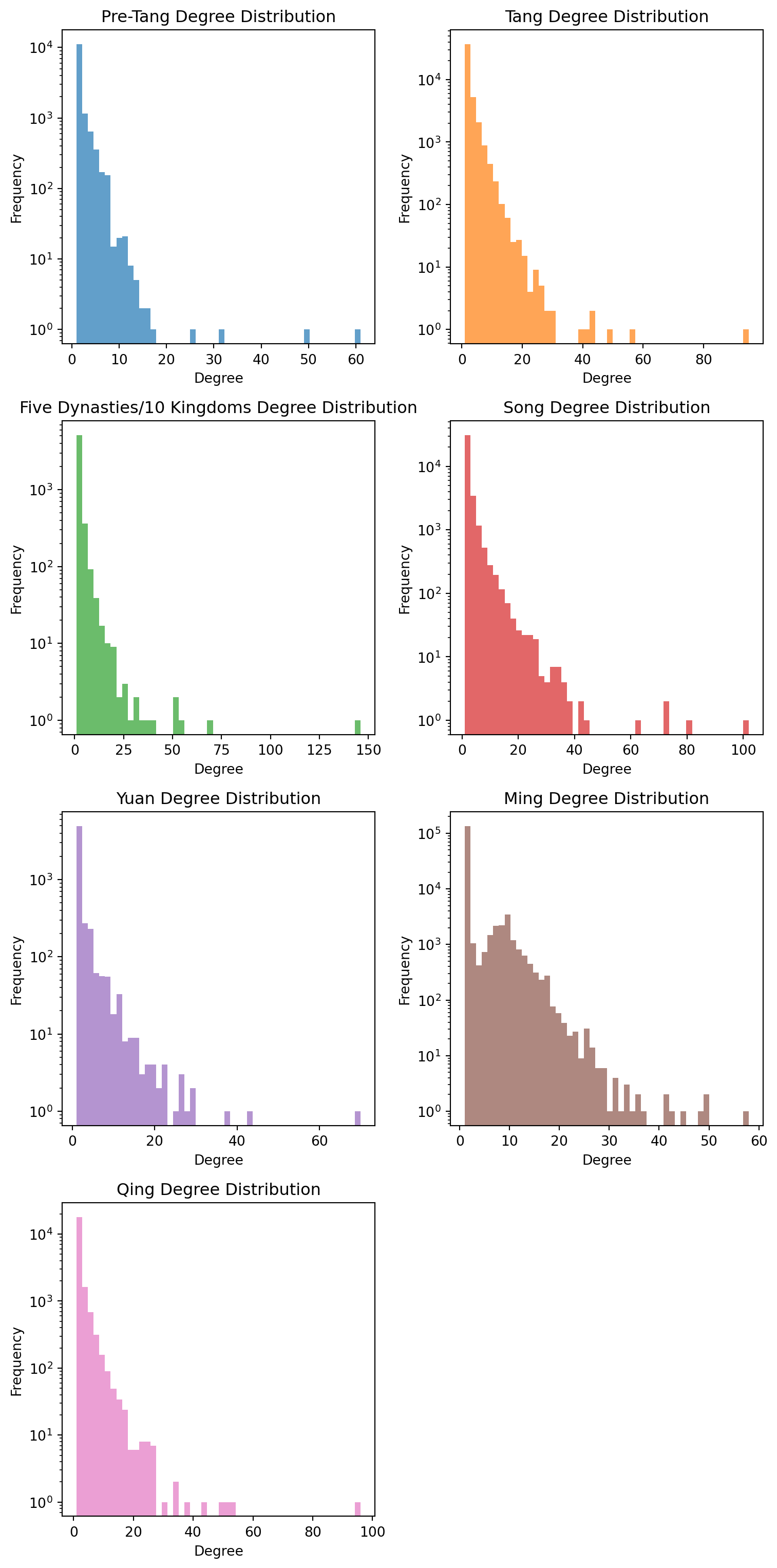
def analyze_degree_distributions(dynasty_graphs, ordered_dynasties): plt.figure(figsize=(8, 16)) # Adjusted plot size for i, dyn_name inenumerate(ordered_dynasties): G = dynasty_graphs.get(dyn_name)if G isNone:continue degrees = [d for n, d in G.degree()]# Plot distribution: Calculate rows needed for max 2 columns num_dynasties =len(ordered_dynasties) rows = (num_dynasties +1) //2 plt.subplot(rows, 2, i+1) # Set to max 2 images in a row plt.hist(degrees, bins=50, alpha=0.7, color=f'C{i}') plt.title(f'{dyn_name} Degree Distribution') plt.xlabel('Degree') plt.ylabel('Frequency') plt.yscale('log') # Log scale to see heavy tails# Calculate distribution statistics mean_deg = np.mean(degrees) median_deg = np.median(degrees) max_deg =max(degrees) std_deg = np.std(degrees) skewness = stats.skew(degrees)print(f"{dyn_name}: Mean={mean_deg:.2f} "f"Std={std_deg:.2f}, Skewness={skewness:.2f}") plt.tight_layout() plt.show()# Run analysisanalyze_degree_distributions(dynasty_graphs, ordered_dynasties)
Our visualization is a histogram of the frequency of high degree nodes. The log-scale histograms show the highly skewed nature of our networks - a few individuals with many connections, and many individuals with few connections. All of them are relatively similar except for the Ming Dynasty.
There are many potential reasons for this, but one that stands out is the Ming Dynasties unique approach to scholar network formation and bureaucratic recruitment, which created a more centralized and hierarchical system compared to other Chinese dynasties. This very selective system created a different social network structure than previous dynasties. The Ming examination system produced a small core of connected scholars and officials who formed the administrative portion of the government. Unlike earlier dynasties where multiple pathways to office existed, the Ming system funneled nearly all political advancement through this single, narrow channel. This single channel was a series of exams which 2-3 million applicants would attempt per year with only about a thousand passing. This process lead to a social network which was more evenly connected than previous or future dynasties.
We will continue our analysis with looking at how many components each dynasty has and their fragmentation and average size.
Show the code
def analyze_connected_components(dynasty_graphs, ordered_dynasties): results = {}for dyn_name in ordered_dynasties: G = dynasty_graphs.get(dyn_name)if G isNone:continue# Get connected components components =list(nx.connected_components(G)) num_components =len(components) component_sizes = [len(c) for c in components]# Calculate metrics largest_component_size =max(component_sizes) if component_sizes else0 fragmentation_index =1- (largest_component_size / G.number_of_nodes()) avg_component_size = np.mean(component_sizes) if component_sizes else0 results[dyn_name] = {"num_components": num_components,"largest_component_size": largest_component_size,"fragmentation_index": fragmentation_index,"avg_component_size": avg_component_size,"component_sizes": component_sizes }print(f"{dyn_name}: Components={num_components}, "f"Largest={largest_component_size}, "f"Fragmentation={fragmentation_index:.4f}, "f"Avg Size={avg_component_size:.2f}")return results# Run analysiscomponent_results = analyze_connected_components(dynasty_graphs, ordered_dynasties)
As expected the Pre-Tang dynasty is quite disconnected with many smaller clusters. Here the high fragmentation reflects genuine political fragmentation. Multiple competing kingdoms produced separate elite networks with limited inter-kingdom marriages or alliances. The Song dynasty has the lowest fragmentation and the largest component meaning most of the network for this dynasty is one large component. This is inline with history as the dynasty was a period of political unity and economic prosperity.
The Yuan dynasty is also very fragmented which is surprising as it covered a large political period. As mentioned above this might show that the Mongol and Chinese elites did not merge well and maintained relatively separate networks. Chinese families might have avoided marriages with Mongol elites and vice versa.
The Ming dynasty has the most components by far but a minuscule largest connected cluster. This might suggest that the examination system created many small, tight-knit groups rather than one massive interconnected network. This resembles modern professional networks where people have strong connections within their company/specialty but weaker connections across them. In general dynasties before Yuan have quite low fragmentation compared to ones after Yuan.
We will continue with temporal patterning analysis to see if within these dynasties there were large changes throughout the years.
We will use the ‘c_index_year’ variable to see if density, clustering, or average degree changes over time change inside a dynasty.
Show the code
def analyze_temporal_patterns(kin_df, biog_df, ordered_dynasties):# Merge to get information for each edge kin_temporal = kin_df.merge(biog_df[['c_personid', 'c_index_year', 'dynasty']], left_on='c_personid_person', right_on='c_personid', how='left') results = {}for dyn_name in ordered_dynasties: dyn_data = kin_temporal[kin_temporal['dynasty_person'] == dyn_name].copy()# Group by time periods (for us 50-year bins)if dyn_data['c_index_year'].notna().sum() >0: min_year =int(dyn_data['c_index_year'].min()) max_year =int(dyn_data['c_index_year'].max()) bins =range(min_year, max_year +50, 50) dyn_data['time_bin'] = pd.cut(dyn_data['c_index_year'], bins=bins)# Calculate metrics per time period temporal_metrics = []for time_bin in dyn_data['time_bin'].cat.categories: bin_data = dyn_data[dyn_data['time_bin'] == time_bin]iflen(bin_data) >10: # Only analyze bins with sufficient data# Create subgraph for this time period edges =zip(bin_data['c_personid_person'], bin_data['c_kin_id']) temp_G = nx.Graph() temp_G.add_edges_from(edges)if temp_G.number_of_nodes() >0: avg_deg = (2* temp_G.number_of_edges()) / temp_G.number_of_nodes() density = nx.density(temp_G) clustering = nx.average_clustering(temp_G) temporal_metrics.append({'time_period': str(time_bin),'avg_degree': avg_deg,'density': density,'clustering': clustering,'nodes': temp_G.number_of_nodes(),'edges': temp_G.number_of_edges() }) results[dyn_name] = temporal_metrics# Print summaryprint(f"\n{dyn_name} Temporal Analysis ({min_year}-{max_year}):")for metric in temporal_metrics[:20]: # Show first 20 time periodsprint(f" {metric['time_period']}: Avg Degree={metric['avg_degree']:.2f}, "f"Density={metric['density']:.6f}, Clustering={metric['clustering']:.4f}")return results# Run temporal analysistemporal_results = analyze_temporal_patterns(kin_df, biog_df, ordered_dynasties)
The findings here are quite interesting there seems to be quite a bit of variation inside of the dynasties. By examining 50-year time bins within each dynasty, we can identify common patterns in how elite networks evolve over dynastic lifecycles:
Pre-Tang: The clustering increases through the years which makes sense as this was a very politically divided period. Increasing clustering over time suggests gradual consolidation of initially fragmented regional elites. As political stability increased, families had more opportunities to form alliances.
Tang: The average degree is quite stable with a slight spike in the middle. Clustering gradually increases from very low (0.0210) to peak at mid-period (0.0667), then drops similar to average degree. The mid-dynasty clustering peak followed by decline mirrors the Tang’s historical trajectory. An early expansion and consolidation, followed by the An Lushan Rebellion (755 CE) and subsequent fragmentation. Our network metrics capture this political crisis.
Five Dynasties/10 Kingdoms Temporal Analysis: Large drop in Average Degree, with a very large decrease in clustering from (0.0755 to 0.0106). This is a period marked by political instability, elite networks could not be maintained like in times of unity.
Song: Late Song becomes more clustered and somewhat denser compared to early Song. Late Song’s increased clustering and density reflects the dynasty’s successful institutional consolidation; the networks strengthening might reflect the examination system maturing and functioning better and better.
Yuan: Large drop in average degree (1.94 to 1.59) and large decrease in clustering (0.1219 to 0.0221). The sharp decline from early to late Yuan suggests that initial Mongol-Chinese elite integration failed to sustain itself.
Ming: Very stable compared to other dynasties. Remarkably stable metrics across time reflect the dynasty’s successful institutional design. The examination system created consistent network formation patterns that persisted across centuries. This is extremely impressive.
Qing: Early Qing is more cohesive than late Qing except for a late density spike that is not accompanied by clustering. The final density spike without clustering increase might reflect desperate attempts to maintain connections during political crisis, but this might be more speculation.
These patterns demonstrate that political institutions profoundly shape social network evolution. Stable, examination-based systems (Song and Ming) produced networks that strengthened over time. Conquest dynasties faced ongoing integration challenges. Fragmented periods prevented stable network formation entirely. We can accurately look at the course of Chinese history through these network metrics. Not only is each node a specific individual, but the bigger picture is also present.
6.0 Conclusion
We have successfully been able to characterize Chinese history and some very influential figures using the CBDB Dataset. We have looked at more both individuals and broader patterns across dynasties and centuries and most importantly been able to link these findings to real Chinese History. The techniques and elements used in this notebook demonstrate how large-scale network analysis methods can be used to uncover meaningful patterns in complex historical and social data through approaches such as community detection, centrality metrics, and temporal segmentation, we gained deeper insight into how elite families, political dynasties, and social roles shaped the connectivity and structure of networks over centuries.
Overall, network analysis provides powerful quantitative tools for looking at small scale relationships and general social structures. Whether applied to history, sociology (family networks), or other disciplines, the combination of network modeling and real life context allows researchers to ask better questions about how social systems function and evolve. The process is iterative; findings prompt new questions, methodologies improve, and insights deepen as data and theory interact. We hope that using a realistic dataset and asking difficult questions without clear answers can inspire some students to pursue and utilize network analysis in research to tackle these kinds of problems.
7.0 Citations
Al-Taie, M. Z., & Kadry, S. (2017). Python for graph and network analysis. Springer. https://doi.org/10.1007/978-3-319-53004-8
Cartwright, Mark. “The Civil Service Examinations of Imperial China.” World History Encyclopedia, https://www.worldhistory.org#organization, 15 Aug. 2025, www.worldhistory.org/article/1335/the-civil-service-examinations-of-imperial-china/.
“Chang’an.” Wikipedia, Wikimedia Foundation, 10 Aug. 2025, en.wikipedia.org/wiki/Chang%27an.
“The China Biographical Database User’s Guide”. The China Biographical Database, Harvard, 26 July 2024, projects.iq.harvard.edu/sites/projects.iq.harvard.edu/files/cbdb/files/cbdb_users_guide.pdf.
“Cui Shi.” Wikipedia, Wikimedia Foundation, 18 July 2025, en.wikipedia.org/wiki/Cui_Shi.
“Dynasties of China.” Wikipedia, Wikimedia Foundation, 27 July 2025, en.wikipedia.org/wiki/Dynasties_of_China.
“Emperor Gaozong of Song”. Wikipedia, Wikimedia Foundation, 18 July 2025, en.wikipedia.org/wiki/Emperor_Gaozong_of_Song.
“Emperor Gaozu of Tang”. Wikipedia, Wikimedia Foundation, 2 Aug. 2025, en.wikipedia.org/wiki/Emperor_Gaozu_of_Tang.
“Kaifeng”. Wikipedia, Wikimedia Foundation, 11 Aug. 2025, en.wikipedia.org/wiki/Kaifeng.
“King Li of Zhou”. Wikipedia, Wikimedia Foundation, 20 July 2025, en.wikipedia.org/wiki/King_Li_of_Zhou.