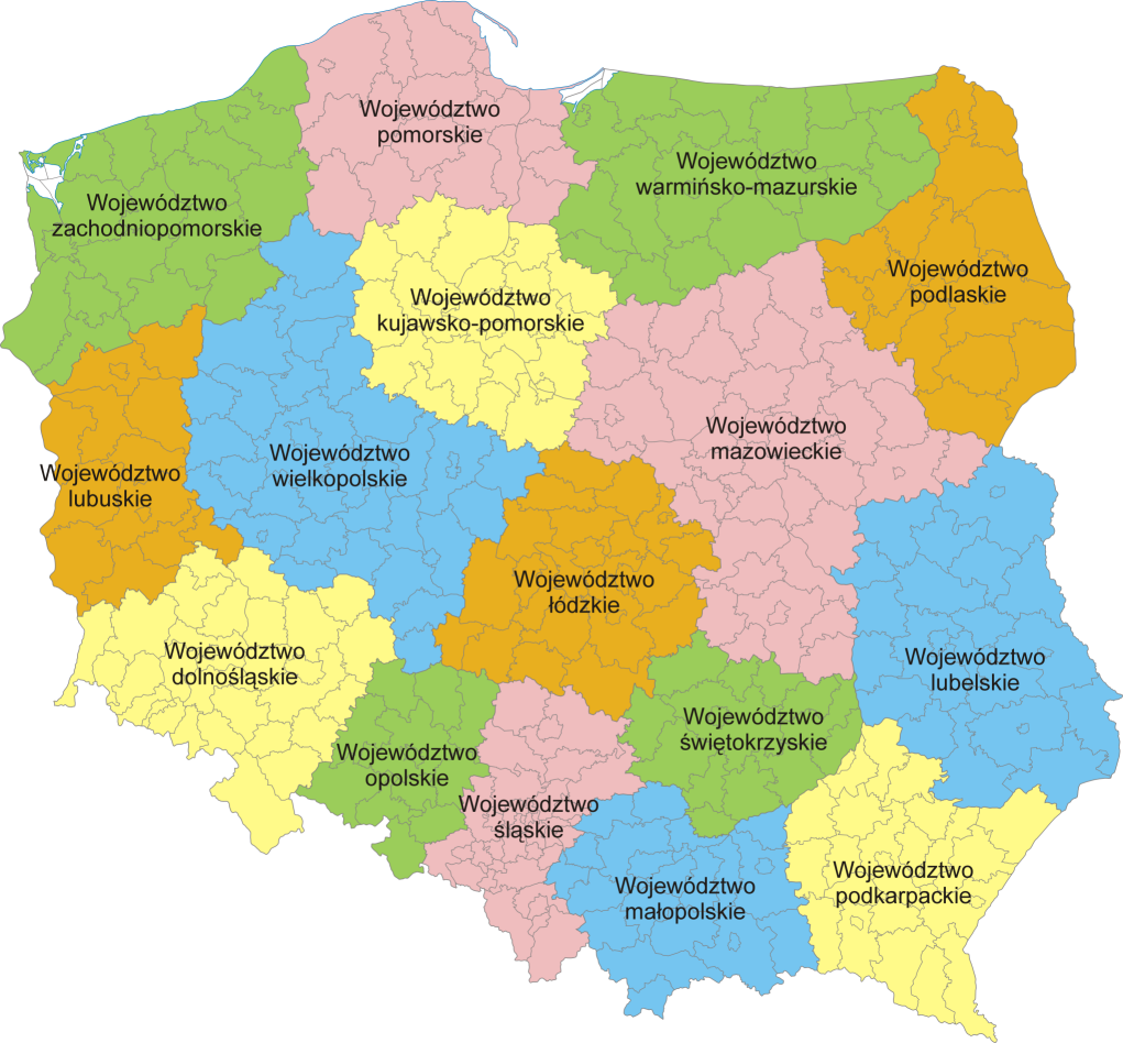
Voivodeship: 12. Slaskie
Nodes: 3592
Education (all): {'3. High': 1864, '2. Mid': 1120, '1. Low': 374, '-2. Prefer not to answer': 40}
Education (Poland): {'6. Postgraduate education': 1171, '2. Secondary education': 1049, '5. University education': 525, '1. Incomplete secondary education': 374, '4. Vocational or professional certification': 168, '3. Some university or vocational certification': 71, '-2. Prefer not to answer': 40, '-3. Does not apply': 0, '7. Doctorate, post-doctorate or equivalent': 0}
Employment: {'1. Full-time employed': 2453, '2. Part-time employed': 245, '4. Unemployed': 234, '6. Homemaker and/or Caretaker': 207, '3. Self-employed': 145, '8. Permanently sick or disabled': 61, '9. Other': 42, '5. In education': 11, '7. Retired': 0}
Health: {'2. Good': 1666, '3. Fair': 1061, '1. Very good': 392, '4. Bad': 205, '5. Very bad': 48, "-1. Don't know": 26, '-2. No answer': 0}
Voivodeship: 1. Dolnoslaskie
Nodes: 2808
Education (all): {'3. High': 1718, '2. Mid': 643, '1. Low': 286, '-2. Prefer not to answer': 12}
Education (Poland): {'6. Postgraduate education': 1016, '5. University education': 529, '2. Secondary education': 481, '1. Incomplete secondary education': 286, '3. Some university or vocational certification': 162, '4. Vocational or professional certification': 138, '7. Doctorate, post-doctorate or equivalent': 35, '-2. Prefer not to answer': 12, '-3. Does not apply': 0}
Employment: {'1. Full-time employed': 2110, '4. Unemployed': 267, '3. Self-employed': 164, '2. Part-time employed': 57, '6. Homemaker and/or Caretaker': 35, '5. In education': 17, '9. Other': 9, '7. Retired': 0, '8. Permanently sick or disabled': 0}
Health: {'2. Good': 1492, '3. Fair': 531, '1. Very good': 441, '4. Bad': 142, "-1. Don't know": 53, '-2. No answer': 0, '5. Very bad': 0}
Voivodeship: 11. Pomorskie
Nodes: 2414
Education (all): {'3. High': 1473, '2. Mid': 661, '1. Low': 157, '-2. Prefer not to answer': 0}
Education (Poland): {'6. Postgraduate education': 791, '2. Secondary education': 573, '5. University education': 502, '1. Incomplete secondary education': 157, '4. Vocational or professional certification': 141, '3. Some university or vocational certification': 88, '7. Doctorate, post-doctorate or equivalent': 39, '-3. Does not apply': 0, '-2. Prefer not to answer': 0}
Employment: {'1. Full-time employed': 1709, '6. Homemaker and/or Caretaker': 211, '4. Unemployed': 131, '2. Part-time employed': 104, '9. Other': 47, '5. In education': 46, '3. Self-employed': 43, '7. Retired': 0, '8. Permanently sick or disabled': 0}
Health: {'2. Good': 1378, '3. Fair': 584, '1. Very good': 265, '4. Bad': 43, "-1. Don't know": 21, '-2. No answer': 0, '5. Very bad': 0}
Voivodeship: 7. Mazowieckie
Nodes: 5317
Education (all): {'3. High': 3532, '2. Mid': 1186, '1. Low': 315, '-2. Prefer not to answer': 0}
Education (Poland): {'6. Postgraduate education': 2309, '5. University education': 1030, '2. Secondary education': 913, '1. Incomplete secondary education': 315, '3. Some university or vocational certification': 273, '4. Vocational or professional certification': 135, '7. Doctorate, post-doctorate or equivalent': 58, '-3. Does not apply': 0, '-2. Prefer not to answer': 0}
Employment: {'1. Full-time employed': 3757, '3. Self-employed': 383, '2. Part-time employed': 334, '6. Homemaker and/or Caretaker': 185, '4. Unemployed': 135, '5. In education': 110, '9. Other': 93, '7. Retired': 23, '8. Permanently sick or disabled': 13}
Health: {'2. Good': 2643, '3. Fair': 1526, '1. Very good': 651, '4. Bad': 134, "-1. Don't know": 66, '-2. No answer': 13, '5. Very bad': 0}
Voivodeship: 9. Podkarpackie
Nodes: 1912
Education (all): {'3. High': 1224, '2. Mid': 501, '1. Low': 104, '-2. Prefer not to answer': 0}
Education (Poland): {'6. Postgraduate education': 638, '5. University education': 535, '2. Secondary education': 364, '3. Some university or vocational certification': 137, '1. Incomplete secondary education': 104, '4. Vocational or professional certification': 51, '-3. Does not apply': 0, '-2. Prefer not to answer': 0, '7. Doctorate, post-doctorate or equivalent': 0}
Employment: {'1. Full-time employed': 1380, '4. Unemployed': 161, '5. In education': 78, '3. Self-employed': 71, '6. Homemaker and/or Caretaker': 69, '2. Part-time employed': 57, '9. Other': 13, '7. Retired': 0, '8. Permanently sick or disabled': 0}
Health: {'2. Good': 1108, '3. Fair': 565, '1. Very good': 130, '5. Very bad': 15, '4. Bad': 11, "-1. Don't know": 0, '-2. No answer': 0}
Voivodeship: 3. Lódzkie
Nodes: 1851
Education (all): {'3. High': 1067, '2. Mid': 530, '1. Low': 126, '-2. Prefer not to answer': 24}
Education (Poland): {'6. Postgraduate education': 593, '2. Secondary education': 497, '5. University education': 339, '4. Vocational or professional certification': 128, '1. Incomplete secondary education': 126, '3. Some university or vocational certification': 33, '-2. Prefer not to answer': 24, '7. Doctorate, post-doctorate or equivalent': 7, '-3. Does not apply': 0}
Employment: {'1. Full-time employed': 1251, '4. Unemployed': 182, '3. Self-employed': 170, '6. Homemaker and/or Caretaker': 51, '8. Permanently sick or disabled': 50, '2. Part-time employed': 24, '5. In education': 19, '7. Retired': 0, '9. Other': 0}
Health: {'2. Good': 844, '3. Fair': 473, '1. Very good': 226, '4. Bad': 204, '-2. No answer': 0, "-1. Don't know": 0, '5. Very bad': 0}
Voivodeship: 6. Malopolskie
Nodes: 3663
Education (all): {'3. High': 2566, '2. Mid': 754, '1. Low': 136, '-2. Prefer not to answer': 30}
Education (Poland): {'6. Postgraduate education': 1650, '5. University education': 691, '2. Secondary education': 569, '3. Some university or vocational certification': 185, '4. Vocational or professional certification': 173, '1. Incomplete secondary education': 136, '7. Doctorate, post-doctorate or equivalent': 52, '-2. Prefer not to answer': 30, '-3. Does not apply': 0}
Employment: {'1. Full-time employed': 2536, '6. Homemaker and/or Caretaker': 305, '3. Self-employed': 236, '2. Part-time employed': 210, '4. Unemployed': 153, '5. In education': 33, '7. Retired': 13, '8. Permanently sick or disabled': 0, '9. Other': 0}
Health: {'2. Good': 1791, '3. Fair': 1148, '1. Very good': 378, '4. Bad': 96, "-1. Don't know": 37, '5. Very bad': 36, '-2. No answer': 0}
Voivodeship: 5. Lubuskie
Nodes: 901
Education (all): {'3. High': 448, '1. Low': 177, '2. Mid': 170, '-2. Prefer not to answer': 62}
Education (Poland): {'5. University education': 253, '1. Incomplete secondary education': 177, '6. Postgraduate education': 172, '2. Secondary education': 120, '-2. Prefer not to answer': 62, '3. Some university or vocational certification': 50, '4. Vocational or professional certification': 23, '-3. Does not apply': 0, '7. Doctorate, post-doctorate or equivalent': 0}
Employment: {'1. Full-time employed': 564, '4. Unemployed': 108, '6. Homemaker and/or Caretaker': 101, '2. Part-time employed': 32, '8. Permanently sick or disabled': 24, '3. Self-employed': 16, '5. In education': 12, '7. Retired': 0, '9. Other': 0}
Health: {'2. Good': 469, '3. Fair': 301, '4. Bad': 51, '1. Very good': 24, '5. Very bad': 12, "-1. Don't know": 0, '-2. No answer': 0}
Voivodeship: 13. Swietokrzyskie
Nodes: 906
Education (all): {'3. High': 462, '2. Mid': 360, '1. Low': 42, '-2. Prefer not to answer': 0}
Education (Poland): {'2. Secondary education': 301, '6. Postgraduate education': 257, '5. University education': 176, '3. Some university or vocational certification': 59, '1. Incomplete secondary education': 42, '4. Vocational or professional certification': 20, '7. Doctorate, post-doctorate or equivalent': 9, '-3. Does not apply': 0, '-2. Prefer not to answer': 0}
Employment: {'1. Full-time employed': 566, '2. Part-time employed': 93, '6. Homemaker and/or Caretaker': 82, '3. Self-employed': 56, '9. Other': 47, '4. Unemployed': 11, '5. In education': 9, '7. Retired': 0, '8. Permanently sick or disabled': 0}
Health: {'2. Good': 459, '3. Fair': 236, '1. Very good': 169, "-1. Don't know": 0, '-2. No answer': 0, '4. Bad': 0, '5. Very bad': 0}
Voivodeship: 2. Kujawsko-Pomorskie
Nodes: 1992
Education (all): {'3. High': 1171, '2. Mid': 489, '1. Low': 225, '-2. Prefer not to answer': 17}
Education (Poland): {'5. University education': 544, '6. Postgraduate education': 532, '2. Secondary education': 437, '1. Incomplete secondary education': 225, '4. Vocational or professional certification': 95, '3. Some university or vocational certification': 52, '-2. Prefer not to answer': 17, '-3. Does not apply': 0, '7. Doctorate, post-doctorate or equivalent': 0}
Employment: {'1. Full-time employed': 1100, '4. Unemployed': 337, '6. Homemaker and/or Caretaker': 175, '2. Part-time employed': 161, '5. In education': 59, '3. Self-employed': 44, '9. Other': 26, '7. Retired': 0, '8. Permanently sick or disabled': 0}
Health: {'2. Good': 919, '3. Fair': 551, '1. Very good': 319, '4. Bad': 96, '5. Very bad': 17, "-1. Don't know": 0, '-2. No answer': 0}
Voivodeship: 16. Zachodnio-Pomorskie
Nodes: 1056
Education (all): {'3. High': 544, '2. Mid': 334, '1. Low': 111, '-2. Prefer not to answer': 12}
Education (Poland): {'2. Secondary education': 277, '6. Postgraduate education': 238, '5. University education': 202, '1. Incomplete secondary education': 111, '7. Doctorate, post-doctorate or equivalent': 73, '3. Some university or vocational certification': 57, '4. Vocational or professional certification': 31, '-2. Prefer not to answer': 12, '-3. Does not apply': 0}
Employment: {'1. Full-time employed': 738, '2. Part-time employed': 128, '4. Unemployed': 86, '8. Permanently sick or disabled': 22, '5. In education': 15, '9. Other': 12, '3. Self-employed': 0, '7. Retired': 0, '6. Homemaker and/or Caretaker': 0}
Health: {'2. Good': 599, '3. Fair': 269, '1. Very good': 111, "-1. Don't know": 22, '-2. No answer': 0, '4. Bad': 0, '5. Very bad': 0}
Voivodeship: 15. Wielkopolskie
Nodes: 3679
Education (all): {'3. High': 2160, '2. Mid': 1088, '1. Low': 218, '-2. Prefer not to answer': 37}
Education (Poland): {'6. Postgraduate education': 1321, '2. Secondary education': 897, '5. University education': 750, '1. Incomplete secondary education': 218, '3. Some university or vocational certification': 191, '4. Vocational or professional certification': 65, '-2. Prefer not to answer': 37, '7. Doctorate, post-doctorate or equivalent': 24, '-3. Does not apply': 0}
Employment: {'1. Full-time employed': 2626, '4. Unemployed': 272, '2. Part-time employed': 242, '9. Other': 118, '3. Self-employed': 96, '6. Homemaker and/or Caretaker': 60, '5. In education': 57, '7. Retired': 32, '8. Permanently sick or disabled': 0}
Health: {'2. Good': 1987, '3. Fair': 921, '1. Very good': 400, '4. Bad': 100, '5. Very bad': 41, '-2. No answer': 36, "-1. Don't know": 18}
Voivodeship: 10. Podlaskie
Nodes: 1063
Education (all): {'3. High': 612, '2. Mid': 302, '1. Low': 99, '-2. Prefer not to answer': 0}
Education (Poland): {'6. Postgraduate education': 421, '2. Secondary education': 266, '5. University education': 142, '1. Incomplete secondary education': 99, '4. Vocational or professional certification': 49, '3. Some university or vocational certification': 36, '-3. Does not apply': 0, '-2. Prefer not to answer': 0, '7. Doctorate, post-doctorate or equivalent': 0}
Employment: {'1. Full-time employed': 728, '4. Unemployed': 133, '3. Self-employed': 57, '6. Homemaker and/or Caretaker': 49, '2. Part-time employed': 46, '5. In education': 0, '7. Retired': 0, '8. Permanently sick or disabled': 0, '9. Other': 0}
Health: {'2. Good': 518, '3. Fair': 311, '1. Very good': 177, '4. Bad': 7, '-2. No answer': 0, "-1. Don't know": 0, '5. Very bad': 0}
Voivodeship: 4. Lubelskie
Nodes: 1756
Education (all): {'3. High': 987, '2. Mid': 536, '1. Low': 137, '-2. Prefer not to answer': 13}
Education (Poland): {'6. Postgraduate education': 794, '2. Secondary education': 419, '1. Incomplete secondary education': 137, '3. Some university or vocational certification': 117, '5. University education': 111, '4. Vocational or professional certification': 82, '-2. Prefer not to answer': 13, '-3. Does not apply': 0, '7. Doctorate, post-doctorate or equivalent': 0}
Employment: {'1. Full-time employed': 1014, '2. Part-time employed': 191, '3. Self-employed': 177, '6. Homemaker and/or Caretaker': 162, '5. In education': 56, '8. Permanently sick or disabled': 50, '4. Unemployed': 23, '7. Retired': 0, '9. Other': 0}
Health: {'2. Good': 976, '3. Fair': 334, '1. Very good': 183, '4. Bad': 180, '-2. No answer': 0, "-1. Don't know": 0, '5. Very bad': 0}
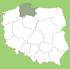
Voivodeship: 14. Warminsko-Mazurskie
Nodes: 1092
Education (all): {'2. Mid': 497, '3. High': 454, '1. Low': 93, '-2. Prefer not to answer': 0}
Education (Poland): {'2. Secondary education': 411, '6. Postgraduate education': 324, '1. Incomplete secondary education': 93, '3. Some university or vocational certification': 86, '5. University education': 67, '4. Vocational or professional certification': 47, '7. Doctorate, post-doctorate or equivalent': 16, '-3. Does not apply': 0, '-2. Prefer not to answer': 0}
Employment: {'1. Full-time employed': 779, '6. Homemaker and/or Caretaker': 131, '3. Self-employed': 107, '5. In education': 14, '4. Unemployed': 13, '2. Part-time employed': 0, '7. Retired': 0, '8. Permanently sick or disabled': 0, '9. Other': 0}
Health: {'2. Good': 584, '3. Fair': 298, '1. Very good': 94, '4. Bad': 55, '5. Very bad': 13, "-1. Don't know": 0, '-2. No answer': 0}
Voivodeship: 8. Opolskie
Nodes: 656
Education (all): {'2. Mid': 296, '3. High': 264, '1. Low': 46, '-2. Prefer not to answer': 20}
Education (Poland): {'2. Secondary education': 270, '6. Postgraduate education': 219, '1. Incomplete secondary education': 46, '5. University education': 45, '3. Some university or vocational certification': 26, '-2. Prefer not to answer': 20, '-3. Does not apply': 0, '4. Vocational or professional certification': 0, '7. Doctorate, post-doctorate or equivalent': 0}
Employment: {'1. Full-time employed': 433, '3. Self-employed': 121, '6. Homemaker and/or Caretaker': 47, '2. Part-time employed': 14, '4. Unemployed': 11, '5. In education': 0, '7. Retired': 0, '8. Permanently sick or disabled': 0, '9. Other': 0}
Health: {'2. Good': 441, '1. Very good': 78, '3. Fair': 76, '4. Bad': 31, '-2. No answer': 0, "-1. Don't know": 0, '5. Very bad': 0}