import numpy as np
import pandas as pd
import matplotlib.pyplot as plt

from sklearn.neighbors import KNeighborsRegressor
from sklearn.preprocessing import StandardScaler
from sklearn.pipeline import make_pipeline
from sklearn.model_selection import train_test_split, KFold, cross_val_score
from sklearn.metrics import mean_squared_error

RANDOM_STATE = 42 # fix randomness so splits and folds are reproduciblePrediction, Inference, and Causality
Python
machine learning
prediction
causal inference
cross-validation
The first notebook in the Causal ML stream. We meet the supervised-learning way of thinking: prediction versus inference, train/test splits, loss functions, k-nearest-neighbours regression, the bias-variance tradeoff, and cross-validation, and we set up the causal questions to come.
Outline
Prerequisites
- Multiple regression and OLS (COMET Intermediate: Introduction to Regression, Multiple Regression)
- Experience with
pandasand basic Python at the COMET-intermediate level - You do not need any prior machine-learning background. Train/test splits, cross-validation, and the “ML” framing of statistics are all introduced here from scratch. This is true for the whole notebook stream.
Learning Outcomes
By the end of this notebook you will be able to:
- Explain the difference between prediction and inference as goals of statistical modelling.
- Set up a supervised learning problem: identify the target \(Y\), the features \(X\), and the function \(\hat{f}\) we are trying to learn.
- Split data into training and test sets, and explain why we do this.
- Define mean squared error (MSE) and compute training and test MSE.
- Fit a k-nearest-neighbours (KNN) regression and describe in one sentence what it does.
- State the bias-variance tradeoff and recognise it on a U-shaped test-MSE plot.
- Use k-fold cross-validation to select a hyperparameter.
- Articulate why a good predictor is not an answer to a causal question.
1. Two kinds of questions
Imagine we hand you a dataset of households, each with its income, the age and education of the head, the size of the family, and how much the household has saved. We also record one policy fact about each household: whether the job it holds offers a 401(k), the tax-advantaged retirement account that many U.S. employers sponsor. There are two very different questions you might ask of this data:
- Prediction. Given a household’s income, age, and family size, how much should we expect it to have saved?
- Inference / causal. What is the effect of 401(k) eligibility on how much a household saves?
The first asks for a good guess of the outcome, while the second asks for a cause-and-effect number: what would happen to the same household’s savings if we reached in and made it eligible for a 401(k), holding everything else fixed?
Most of your econometrics training so far (ECON 226, 325, 326) was really aimed at the second kind of question. This stream deliberately switches focus for a few notebooks. We are going to get very good at the first kind of question first, build a real prediction toolkit, and only then (from Notebook 4 onward) turn that toolkit into something that can answer the eligibility question for real.
This notebook is entirely about the prediction question, and prediction turns out to be everywhere: almost every machine-learning system you interact with is a prediction system, whether it’s credit scoring guessing who will repay, ad targeting guessing what you’ll click, or a recommendation engine guessing what you’ll watch next. None of them is built to tell you why.
1.1. The supervised learning setup
Machine learning has its own vocabulary for ideas you already know. Here is the translation:
| Econometrics | Machine learning |
|---|---|
| dependent variable / outcome | target, written \(Y\) |
| independent variables / regressors | features, written \(X\) |
| the coefficients \(\beta\) | mostly invisible; we care about the function \(\hat{f}\) instead |
The goal of supervised learning is to learn a function \(\hat{f}\) so that
\[ \hat{f}(X) \approx Y \]
on data we have not seen before. That last part is very important: a flexible enough model can always make its in-sample fit look good, so the real test is whether it predicts well on data it has not been trained on. This is a key theme of this notebook stream.
When the target \(Y\) is continuous (like savings in dollars), the task is called regression. When \(Y\) is a category (employed / not, default / repay), it is called classification. In this notebook we focus on regression.
The key reframing
In OLS we asked: what is the coefficient on income? In machine learning we ask: how well can we predict the outcome? It’s the same data with a different goal, and this is the main difference from ECON 326.
1.2 401(k) Saving Data
We will use the 401(k) dataset, a standard dataset in the study of savings behaviour and a common example in causal-ML literature. Each row is a U.S. household from the 1991 Survey of Income and Program Participation. The outcome we model is net_tfa, the household’s net financial assets (everything it has saved, minus its debt), measured in thousands of dollars. The features are the household’s characteristics: income (inc, also in thousands), the age and years of education of the reference person, family size, and a set of dummy variables for being married, having two earners, owning a defined-benefit pension (db), owning an IRA (pira), and owning a home (hown). The last column, e401, marks whether the household is eligible for a 401(k); that is the variable the rest of this stream will treat as a cause, but here it is just one more feature to predict from.
savings = pd.read_csv("datasets/Pension401k.csv")

# The features (X) we will predict from, and the target (y) we want to predict.
features = ["age", "inc", "educ", "fsize", "marr",
            "twoearn", "db", "pira", "hown", "e401"]
target = "net_tfa"

savings[features + [target]].head()| age | inc | educ | fsize | marr | twoearn | db | pira | hown | e401 | net_tfa | |
|---|---|---|---|---|---|---|---|---|---|---|---|
| 0 | 47 | 6.765 | 8 | 2 | 0 | 0 | 0 | 0 | 1 | 0 | 0.000 |
| 1 | 36 | 28.452 | 16 | 1 | 0 | 0 | 0 | 0 | 1 | 0 | 1.015 |
| 2 | 37 | 3.300 | 12 | 6 | 0 | 0 | 1 | 0 | 0 | 0 | -2.000 |
| 3 | 58 | 52.590 | 16 | 2 | 1 | 1 | 0 | 0 | 1 | 0 | 15.000 |
| 4 | 32 | 21.804 | 11 | 1 | 0 | 0 | 0 | 0 | 1 | 0 | 0.000 |
We will print summary statistics for the dataset:
print("Number of households:", len(savings))
print(savings[["net_tfa", "inc", "age", "educ", "fsize"]].describe().round(1))
Number of households: 9915
net_tfa inc age educ fsize
count 9915.0 9915.0 9915.0 9915.0 9915.0
mean 18.1 37.2 41.1 13.2 2.9
std 63.5 24.8 10.3 2.8 1.5
min -502.3 -2.7 25.0 1.0 1.0
25% -0.5 19.4 32.0 12.0 2.0
50% 1.5 31.5 40.0 12.0 3.0
75% 16.5 48.6 48.0 16.0 4.0
max 1536.8 242.1 64.0 18.0 13.0Net financial assets vary enormously: the typical household has saved only a few thousand dollars, but the spread runs from deep in debt to well over a million. Income is the obvious thing it should track, and the plot below shows that it does, with some natural variation. Each point is a household; nearby households along the income axis tend to have similar savings, but the cloud is wide. Income explains some of savings and a lot is left over to other factors.
sample = savings.sample(2000, random_state=RANDOM_STATE)
plt.figure(figsize=(9, 6))
sc = plt.scatter(sample["inc"], sample["age"], c=sample["net_tfa"].clip(-50, 150),
                 s=12, alpha=0.5, cmap="viridis")
plt.colorbar(sc, label="net financial assets ($1,000s)")
plt.xlabel("income ($1,000s)")
plt.ylabel("age")
plt.title("Similar households tend to have similar savings (noisily)")
plt.show()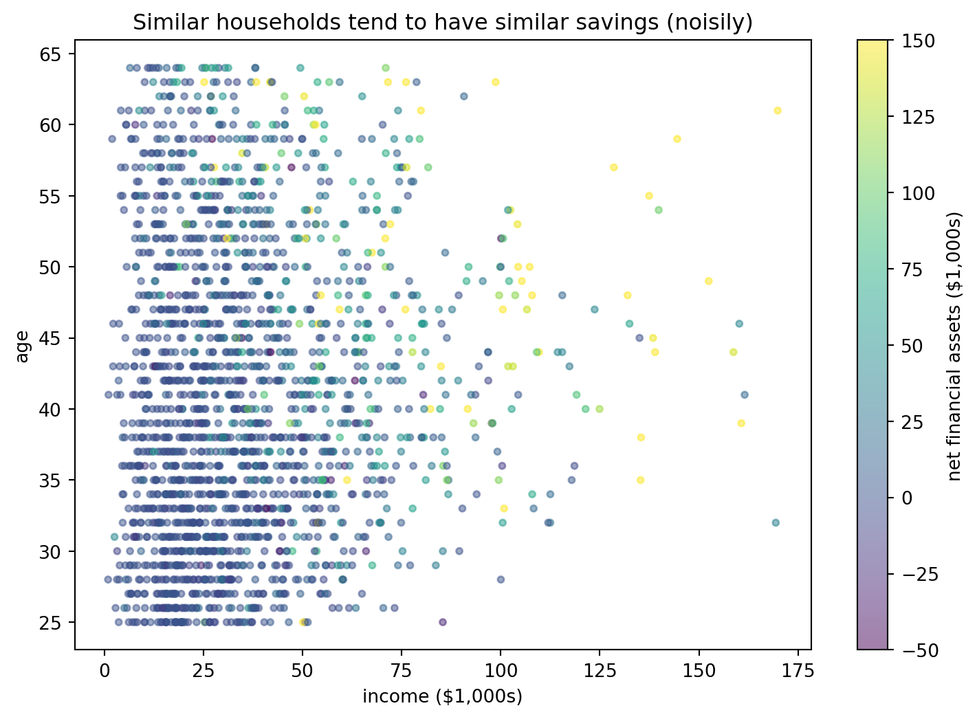
The picture above is the basic premise of the model we’re about to use: to guess a household’s savings, find the households most like it and look at what they saved. Before we can do that we need to do one small thing first. The model compares households by measuring the distance between them, and distance is sensitive to scale: income runs into the hundreds while family size is a single digit, so without a fix the big-numbered feature would dominate every distance. So we put every feature on the same footing, subtracting its mean and dividing by its standard deviation. There’s a subtlety we have to respect here, since those means and standard deviations must be computed on the training data only, never on data we’re about to test on, or information leaks across the split we’re about to make. The way we enforce this is by bundling the scaling step together with the model into a single object, a pipeline, so that every time we fit, the scaling is recomputed on just the data being fit and nothing else.
y = savings[target].to_numpy()
X = savings[features]

# Bundle into one object and create our pipeline
def make_knn(k):
    return make_pipeline(StandardScaler(), KNeighborsRegressor(n_neighbors=k))

X.head().round(1)| age | inc | educ | fsize | marr | twoearn | db | pira | hown | e401 | |
|---|---|---|---|---|---|---|---|---|---|---|
| 0 | 47 | 6.8 | 8 | 2 | 0 | 0 | 0 | 0 | 1 | 0 |
| 1 | 36 | 28.5 | 16 | 1 | 0 | 0 | 0 | 0 | 1 | 0 |
| 2 | 37 | 3.3 | 12 | 6 | 0 | 0 | 1 | 0 | 0 | 0 |
| 3 | 58 | 52.6 | 16 | 2 | 1 | 1 | 0 | 0 | 1 | 0 |
| 4 | 32 | 21.8 | 11 | 1 | 0 | 0 | 0 | 0 | 1 | 0 |
The preview above shows X in its raw units, before any scaling. The standardizing happens inside the pipeline at the moment we fit, so we never overwrite the original columns and never have to remember to scale by hand, and the readable raw numbers are what we keep in front of us.
2 In-sample fit lies to us!
A model can look perfect on the data you fit it to and be useless on new data.
To see this we need new data. We don’t have a second sample of households, so we set one aside: we randomly hold out a chunk of our data, fit the model on the rest, and judge it on the held-out chunk it never saw. This is the train/test split.
X_train, X_test, y_train, y_test = train_test_split(
    X, y, test_size=0.3, random_state=RANDOM_STATE)

print("Training households:", len(X_train))
print("Test households    :", len(X_test))
Training households: 6940
Test households : 29752.1 KNN & 1-Nearest-Neighbour
The model we use to show this is k-nearest-neighbours (KNN). To predict a household’s savings, KNN finds the \(k\) households in the training data that are most similar to it (its nearest neighbours, measured by how close their features are) and returns the average savings of that group. The number \(k\) is ours to choose.
To see this in action we fit a 1-nearest-neighbour model: to predict any household’s savings, it copies the savings of the single most-similar household in the training data.
knn1 = make_knn(1)
knn1.fit(X_train, y_train)

train_mse = mean_squared_error(y_train, knn1.predict(X_train))
test_mse = mean_squared_error(y_test, knn1.predict(X_test))

print(f"1-NN training MSE: {train_mse:.1f}")
print(f"1-NN test MSE    : {test_mse:.1f}")
1-NN training MSE: 0.0
1-NN test MSE : 5191.2The training MSE is zero, which looks weird. With \(k = 1\) the model predicts each training household by looking for its single nearest neighbour, and in the training data every household is its own nearest neighbour, so the model simply hands back the savings figure it already saw. It has memorised the training set. The test MSE is the number we’re really after, and it’s enormous: on households the model was never fit to, copying the single closest match is very inaccurate.
The plot below makes the gap visible. It compares the model’s predictions to the actual values, on the training set (left) and on the held-out test set (right).
train_pred = knn1.predict(X_train)
test_pred = knn1.predict(X_test)

lims = [-100, 400]
fig, axes = plt.subplots(1, 2, figsize=(11, 5), sharex=True, sharey=True)
for ax, actual, predicted, name in [
        (axes[0], y_train, train_pred, "training set"),
        (axes[1], y_test, test_pred, "test set")]:
    ax.scatter(actual, predicted, s=10, alpha=0.3, color="grey")
    ax.plot(lims, lims, color="black", linewidth=1)  # identity line y = x
    ax.set_xlim(lims)
    ax.set_ylim(lims)
    ax.set_xlabel("actual net financial assets ($1,000s)")
    ax.set_title(f"1-NN on the {name}")
axes[0].set_ylabel("predicted net financial assets ($1,000s)")
plt.show()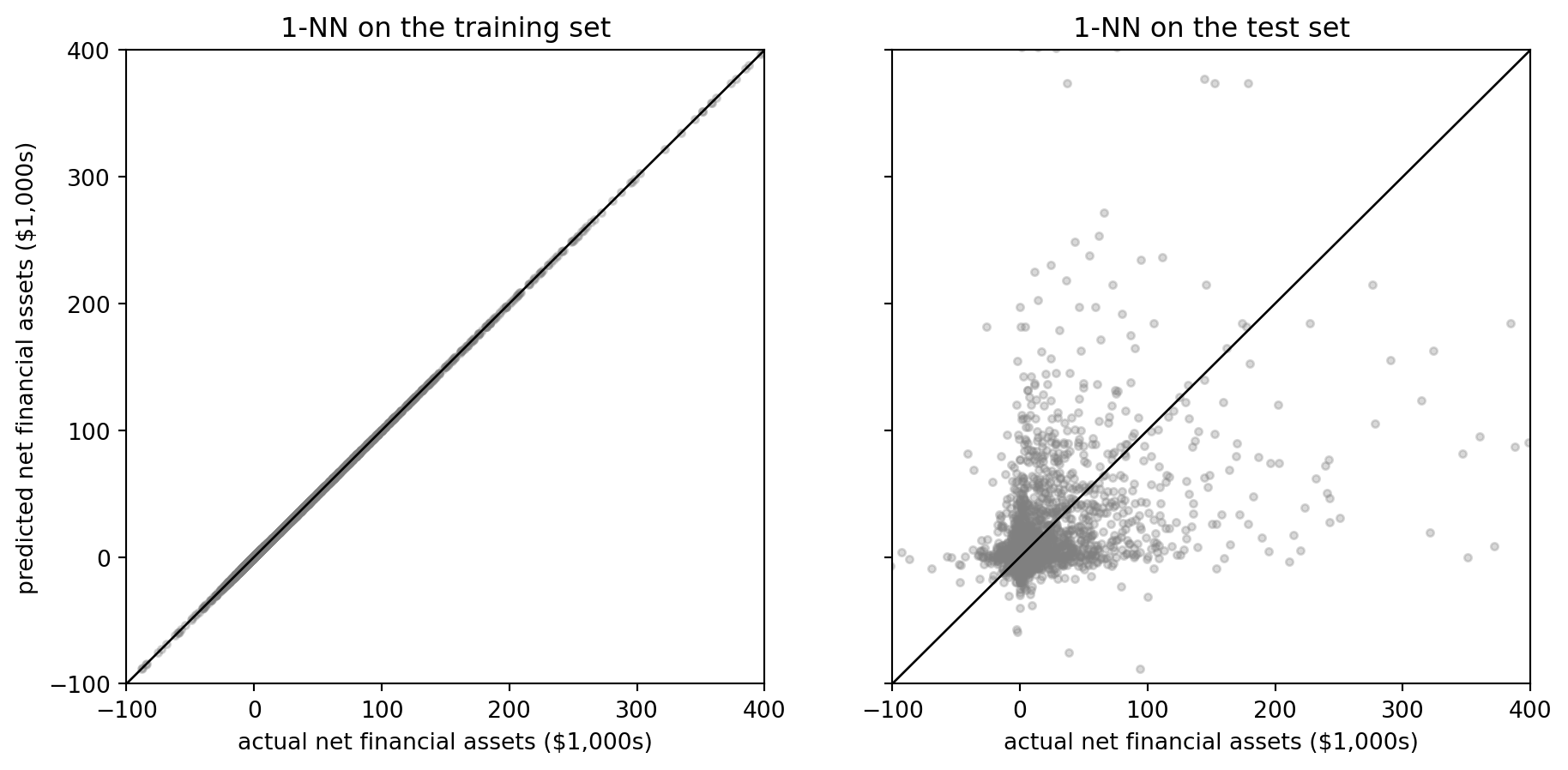
On the training set every prediction lands right on the 45-degree line, because the model is reading back values it memorised. On the test set the scatter spreads out wildly, and that spread is the model’s skill on households it has never seen. A low error on the data the model was fit to is the model flattering itself, and the wide scatter on the right is the truth. The ability to do well on new data is called generalization, and it’s the only thing we actually care about. This is why having a proper pipeline with test/train split and not showing the test data is very important.
Self-test
Why can we not just report MSE on the data we fit the model to and call it a day?
Show / hide answer
Because a flexible enough model can drive the training MSE to zero by memorising the data, without learning anything that transfers to new cases. Training MSE measures memorisation; test MSE measures generalization. Only the second is what we want.3. Loss functions
To say one model is “better” than another we need a number. For regression, the standard one is mean squared error (this is what we used in Econ 326):
\[ \text{MSE} = \frac{1}{n} \sum_{i=1}^{n} \left( Y_i - \hat{f}(X_i) \right)^2 \]
This is exactly the quantity OLS minimises: the average squared gap between the truth \(Y_i\) and the prediction \(\hat{f}(X_i)\). The only new idea is which data we compute it on:
- Training MSE: MSE computed on the data the model was fit to. Measures memorisation.
- Test MSE: MSE computed on held-out data. Measures generalization.
4. Choosing K and hyperparameters
To predict a household’s savings with k-nearest-neighbours regression, we do about the simplest thing we can. We measure how similar that household is to every household in the training data, using all of the features, find the \(k\) closest matches, and report the average of their savings. There’s no equation to estimate and no coefficients to read off, we just look up the most similar households and average their outcomes.
The number \(k\), how many neighbours to average, is something we choose. A value we set ourselves rather than estimate from the data is called a hyperparameter. Pick \(k\) too small and the model leans on one or two unique neighbours; pick \(k\) too large and it averages over households that are not really comparable. The rest of this notebook is about how to choose \(k\). This is also why we scaled the features back in section 1.2: KNN decides who counts as a neighbour by measuring distance, so a feature measured in big numbers would otherwise dominate that distance.
To see what \(k\) does, let us strip the problem down to a single feature, inc, and watch the predicted savings curve change as we dial \(k\) up.
inc_train = X_train[["inc"]]
inc_grid = pd.DataFrame({"inc": np.linspace(
    inc_train["inc"].min(), inc_train["inc"].max(), 300)})

plt.figure(figsize=(9, 6))
plt.scatter(inc_train["inc"], y_train, s=10, alpha=0.15,
            color="grey", label="training households")

for k in [1, 50, 500, 5000]:
    model = make_knn(k).fit(inc_train, y_train)
    plt.plot(inc_grid["inc"], model.predict(inc_grid), linewidth=2,
             label=f"k = {k}")

plt.ylim(-20, 120)
plt.xlabel("income ($1,000s)")
plt.ylabel("net financial assets ($1,000s)")
plt.title("What k does in KNN: from jagged (k=1) to flat (k=5,000)")
plt.legend()
plt.show()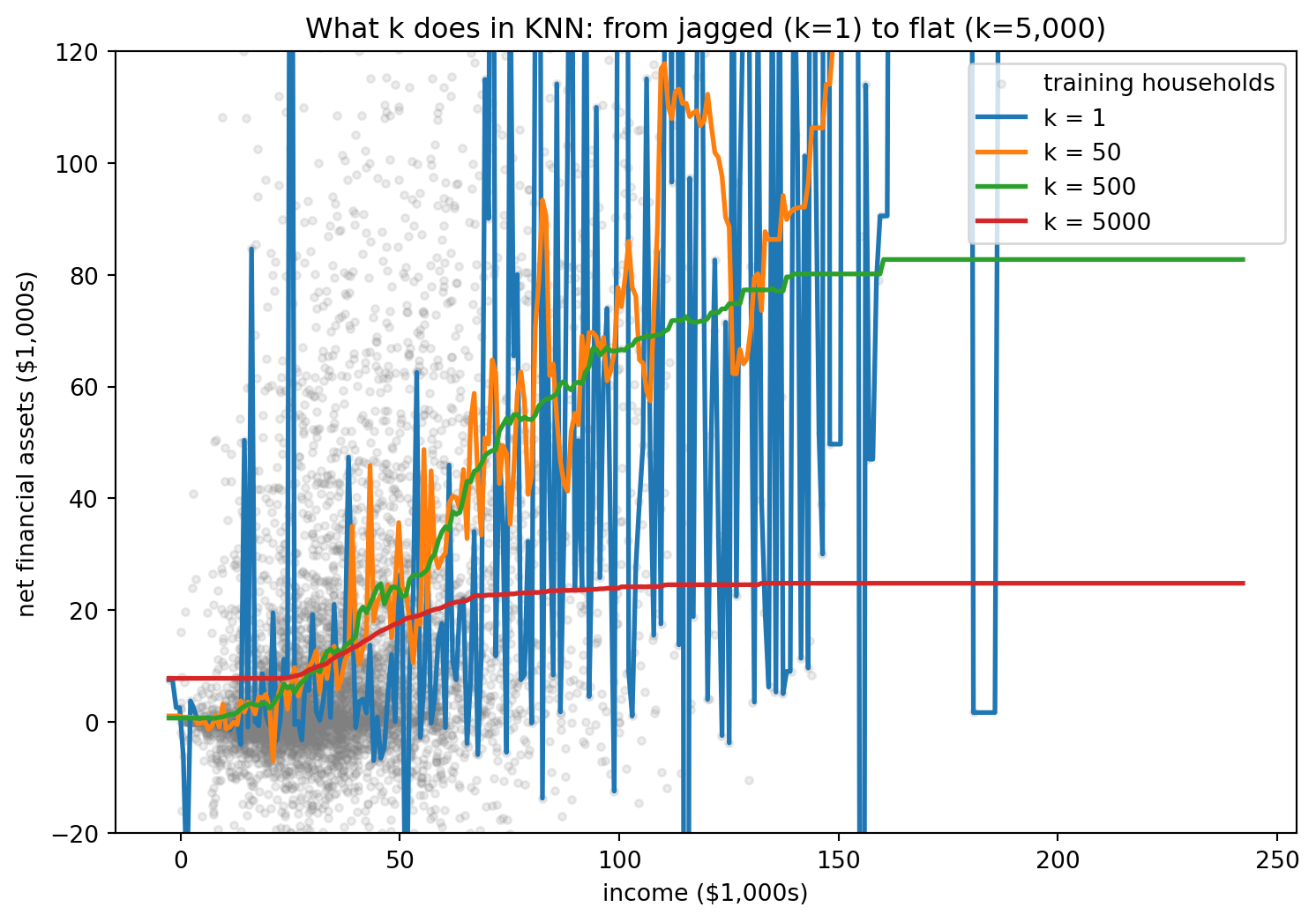
Look at the graph above:
k = 1zig-zags through every point, following the training data exactly.k = 5,000averages over so many households that the curve is nearly flat, ignoring real structure.- Somewhere in between is a sensible middle ground.
If you are running this notebook in a live session (Jupyter/Colab or locally), the slider below lets you feel the tradeoff directly: drag \(k\) and watch the curve go from jagged to smooth.
from ipywidgets import interact, IntSlider

def show_knn(k):
    model = make_knn(k).fit(inc_train, y_train)
    plt.figure(figsize=(9, 5))
    plt.scatter(inc_train["inc"], y_train, s=8, alpha=0.12, color="grey")
    plt.plot(inc_grid["inc"], model.predict(inc_grid), color="tab:red", linewidth=2)
    plt.ylim(-20, 120)
    plt.xlabel("income ($1,000s)")
    plt.ylabel("net financial assets ($1,000s)")
    plt.title(f"KNN fit with k = {k}")
    plt.show()

interact(show_knn, k=IntSlider(value=50, min=1, max=5000, step=1));
KNN works in as many variables as we give it. With two we can still see what it does, by colouring the whole plane with the value KNN would predict at each point. The map below uses income and age and a middling \(k\), so each region is shaded by the average savings of the nearby training households.
k_map = 50
two = ["inc", "age"]
m2 = make_knn(k_map).fit(X_train[two], y_train)

gx = np.linspace(X_train["inc"].quantile(.01), X_train["inc"].quantile(.99), 200)
gy = np.linspace(X_train["age"].min(), X_train["age"].max(), 200)
gxx, gyy = np.meshgrid(gx, gy)
grid2 = pd.DataFrame({"inc": gxx.ravel(), "age": gyy.ravel()})
pred2 = m2.predict(grid2).reshape(gxx.shape)

plt.figure(figsize=(9, 6))
cf = plt.contourf(gxx, gyy, pred2.clip(0, 80), levels=20, cmap="viridis")
plt.colorbar(cf, label="predicted savings ($1,000s)")
plt.xlabel("income ($1,000s)")
plt.ylabel("age")
plt.title(f"What KNN predicts across the income-age plane (k = {k_map})")
plt.show()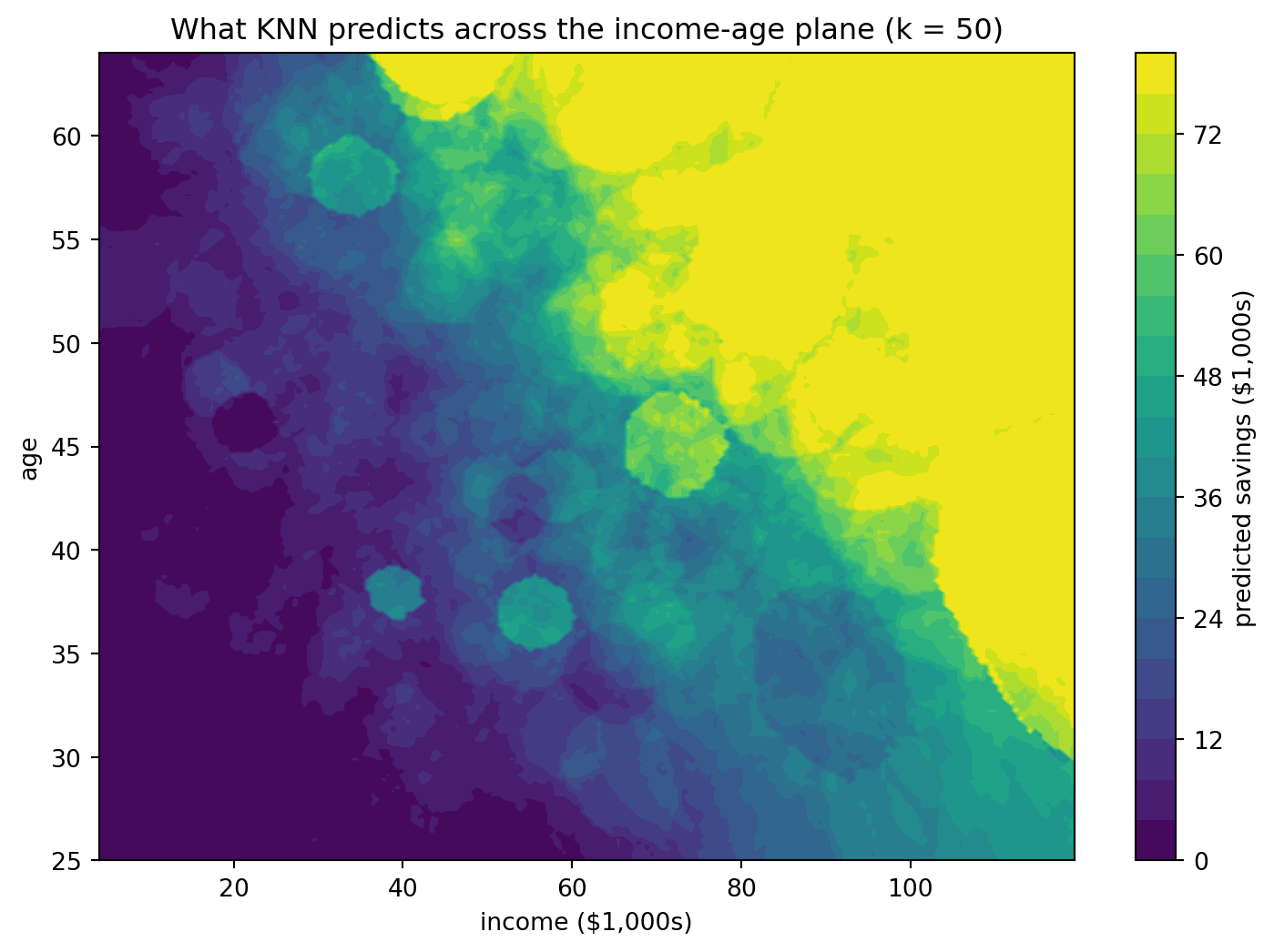
Savings rise toward the top-right, where households are older and higher-income, the corner where well-off older people sit and has higher saving that are further away from younger adults with lower income. This is exactly what we expect to see.
4.1 The bias-variance tradeoff
The pictures above are the bias-variance tradeoff in disguise. Expected test error splits into three pieces:
\[ \text{Expected test error} = \underbrace{\text{bias}^2}_{\text{too rigid}} + \underbrace{\text{variance}}_{\text{too jumpy}} + \underbrace{\text{irreducible noise}}_{\text{unavoidable}} \]
- Bias is systematic error from a model that is too rigid to capture the real pattern.
- Variance is error from a model so flexible it fits the noise, changing wildly if the data changed a little.
- Irreducible noise is the part no model can ever explain. Even with a perfect model and infinite data, two households with the same income, age, and family size can still have very different savings, through an event of some kind, an illness, or something we never measured. That leftover variation is the irreducible part, and no amount of statistical knowledge will drive it to zero.
On real data we can never separate these pieces, because we do not know the true \(f\). But in a simulation we get to choose the truth, so we can watch bias and variance trade off directly. Below we invent a world where savings follow a known smooth curve of income plus noise. We draw three hundred fresh training samples, fit KNN at several values of \(k\) on each, and record how the predictions behave: how far their average sits from the truth (that is bias) and how much they jump around from sample to sample (that is variance).
def truth(x):
    return np.sin(x) + 0.3 * x  # the "real" savings curve, known only because we made it

rng = np.random.default_rng(0)
grid = np.linspace(0.5, 5.5, 50).reshape(-1, 1)
truth_on_grid = truth(grid).ravel()

ks = range(1, 61)
bias2, variance = [], []
for k in ks:
    preds = np.empty((300, len(grid)))
    for m in range(300):
        xs = rng.uniform(0.5, 5.5, 120).reshape(-1, 1)
        ys = truth(xs).ravel() + rng.normal(0, 0.35, 120)
        preds[m] = KNeighborsRegressor(n_neighbors=k).fit(xs, ys).predict(grid)
    bias2.append(np.mean((preds.mean(axis=0) - truth_on_grid) ** 2))
    variance.append(np.mean(preds.var(axis=0)))

bias2, variance = np.array(bias2), np.array(variance)

plt.figure(figsize=(9, 6))
plt.plot(list(ks), bias2, label="bias$^2$ (rises with k)")
plt.plot(list(ks), variance, label="variance (falls with k)")
plt.plot(list(ks), bias2 + variance, color="black", linewidth=2,
         label="bias$^2$ + variance")
plt.xlabel("k (number of neighbours)")
plt.ylabel("error")
plt.title("Bias and variance trade off as k grows (simulation with known truth)")
plt.legend()
plt.show()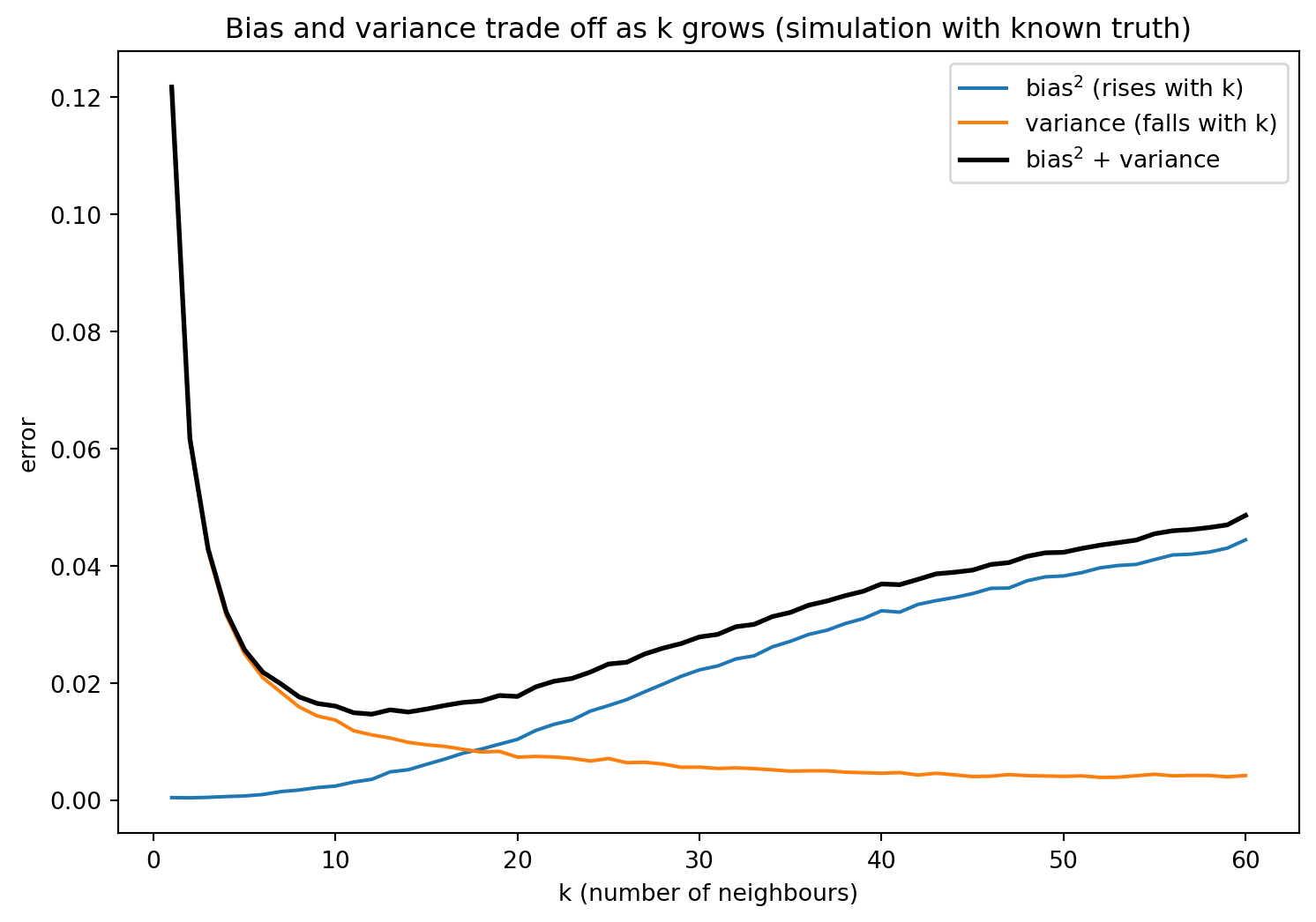
At \(k = 1\) the model is so flexible that its predictions swing all over the place from one sample to the next: variance is high, bias is almost nothing. As \(k\) grows the predictions steady down (variance falls) but the model starts averaging across different points, so it can no longer follow the curve and a systematic gap opens up (bias rises). The black line is U-shaped, and its bottom is the \(k\) that predicts best. This visualization describes how we choose hyperparameters like \(k\) and we’ll come back to it often in this stream.
4.2 Savings Data Again
Back on the real savings data, we cannot plot bias and variance separately, but we can still find the bottom of the U by sweeping \(k\) and recording both training and test MSE at every value.
neighbour_grid = range(1, 101)

train_errors = []
test_errors = []
for k in neighbour_grid:
    model = make_knn(k).fit(X_train, y_train)
    train_errors.append(mean_squared_error(y_train, model.predict(X_train)))
    test_errors.append(mean_squared_error(y_test, model.predict(X_test)))

best_k_by_test = list(neighbour_grid)[int(np.argmin(test_errors))]

plt.figure(figsize=(9, 6))
plt.plot(list(neighbour_grid), train_errors, label="training MSE")
plt.plot(list(neighbour_grid), test_errors, label="test MSE")
plt.axvline(best_k_by_test, color="black", linestyle="--",
            label=f"lowest test MSE at k = {best_k_by_test}")
plt.xlabel("k (number of neighbours)")
plt.ylabel("mean squared error")
plt.title("The bias-variance tradeoff: training MSE vs test MSE")
plt.legend()
plt.show()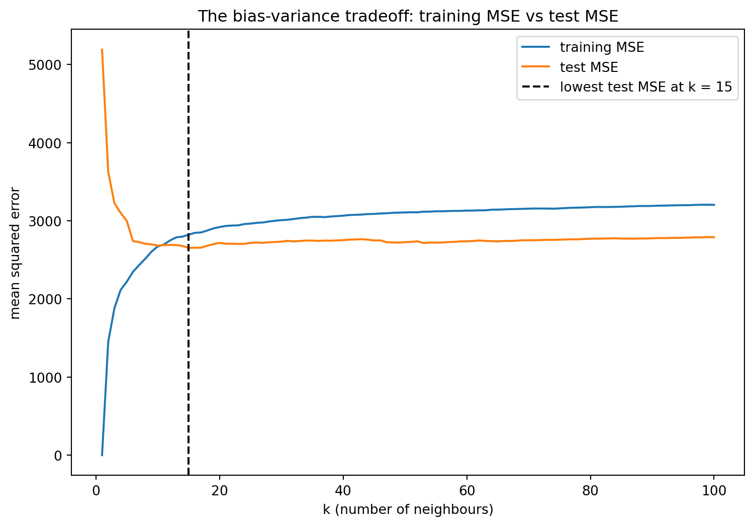
Two things stand out in this plot:
- Training MSE (lower line) is at its lowest at \(k=1\), in fact essentially zero, since each household is its own neighbour. It rises steadily as \(k\) grows and the model must average over more households.
- Test MSE is U-shaped. Too small a \(k\) overfits (high variance) and too large a \(k\) underfits (high bias), so the bottom of the U is the sweet spot.
Think Deeper. You have actually seen a version of this in ECON 326. Adding more regressors to an OLS model always raises in-sample \(R^2\) (the training fit looks better), but that does not always improve real, out-of-sample performance. Same situation here.
There’s a catch: we found the bottom of that U by peeking at the test set. If we use the test set to choose \(k\), we’ve used it up, and it’s no longer an honest estimate of performance on new data. We need a cleaner way to choose \(k\), which is the next section.
4.3 Cross-validation
The fix is to leave the test set in a sealed envelope and choose \(k\) using only the training data. The trick is k-fold cross-validation (k here refers to fold and is not the same k as in k-nearest neighbours).
We split the training data into 5 equal folds. Use 4 of them to fit and the 5th to score, then rotate which fold is held out, five times. Average the five scores. Every household gets used for scoring exactly once, and we never touched the real test set.
n_splits = 5
fig, ax = plt.subplots(figsize=(9, 3))
for round_idx in range(n_splits):
    for fold_idx in range(n_splits):
        held_out = (fold_idx == round_idx)
        ax.barh(round_idx, 1, left=fold_idx, height=0.8,
                color="tab:orange" if held_out else "tab:blue",
                edgecolor="white")
ax.set_yticks(range(n_splits))
ax.set_yticklabels([f"round {i+1}" for i in range(n_splits)])
ax.set_xticks([])
ax.set_xlabel("the 5 folds of the training data")
ax.set_title("5-fold cross-validation (orange = held out for scoring)")
plt.show()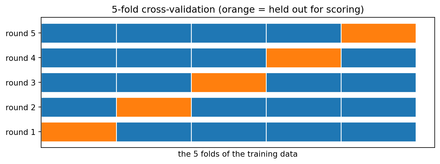
Now we run it for real. For each candidate \(k\) (neighbours), cross_val_score returns the 5 fold scores; we average them. Because the scaler lives inside the pipeline, each fold standardizes using only its own four training folds, and the held-out fold is scaled with those same numbers without ever contributing to them. The test set, sealed away earlier, is untouched throughout.
kfold = KFold(n_splits=5, shuffle=True, random_state=RANDOM_STATE)

candidate_k = range(1, 101)
cv_errors = []
for k in candidate_k:
    scores = cross_val_score(
        make_knn(k),
        X_train, y_train,
        cv=kfold, scoring="neg_mean_squared_error")
    cv_errors.append(-scores.mean())

best_k = list(candidate_k)[int(np.argmin(cv_errors))]

plt.figure(figsize=(9, 6))
plt.plot(list(candidate_k), cv_errors, label="5-fold CV MSE")
plt.axvline(best_k, color="black", linestyle="--",
            label=f"CV picks k = {best_k}")
plt.xlabel("k (number of neighbours)")
plt.ylabel("cross-validated MSE")
plt.title("Choosing k with cross-validation (no peeking at the test set)")
plt.legend()
plt.show()

print("Cross-validation chose k =", best_k)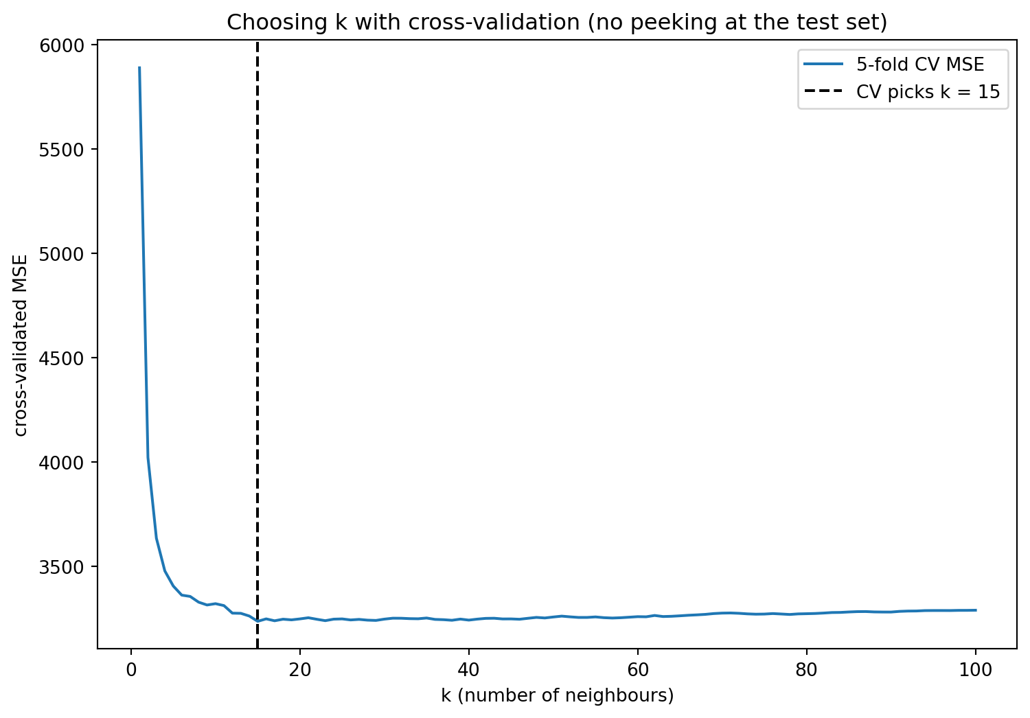
Cross-validation chose k = 15With cross-validation we have found the optimal \(k\) to be 15. Only now, with \(k\) chosen, do we break the seal on the test set, in order to get an honest estimate of how this model performs on new data.
final_model = make_knn(best_k).fit(X_train, y_train)
final_test_mse = mean_squared_error(y_test, final_model.predict(X_test))
baseline_mse = mean_squared_error(y_test, np.full_like(y_test, y_train.mean()))

print(f"Final model: KNN with k = {best_k}")
print(f"Test MSE: {final_test_mse:.1f}")
print(f"Predict-the-average baseline: {baseline_mse:.1f}")
Final model: KNN with k = 15
Test MSE: 2654.4
Predict-the-average baseline: 3708.3The tuned model beats the predict-the-average baseline by ~1050. It’s not a spectacular predictor, because a household’s savings depend on a great deal we didn’t measure, but it’s an improvement, and throughout this stream we’ll learn more techniques to improve our model and its predictive power.
The standard machine-learning recipe
Every later notebook in this stream reuses these four steps:
- Split off a test set and seal it away.
- Cross-validate on the training data to choose the hyperparameter.
- Pick the hyperparameter with the best CV score.
- Evaluate once on the sealed test set.
Self-test
Why not just run cross-validation on the whole dataset and skip the separate test split entirely?
Show / hide answer
Because we used those cross-validation scores to choose \(k\). Once a set of scores has been used to make a modelling decision, it no longer represents honest performance! The sealed test set is the only data untouched by any decision, so it is our source of truth.5. So have we answered the savings question?
We built a model that predicts net financial assets. Now the question this stream is really about:
Does that model tell us the effect of 401(k) eligibility on a household’s savings?
No. This is one of the core concepts of this stream, and it comes down to a few reasons that Notebook 4 returns to. Our model can predict savings well by leaning on features that merely travel alongside eligibility, like income, age, and owning an IRA, so eligibility itself might be doing little of the work the comparison credits it with, and a predictive model can’t tell the difference. Even if we did read a number for the effect of eligibility out of a model that predicts savings well, that number would blend the true effect with selection, since eligible households already differ from ineligible ones in many other ways, tending to be richer, older, and already inclined to save. And underneath all of this is a deeper problem: a causal question is a counterfactual one, asking what would happen to this household’s savings if it became eligible, holding everything else fixed. A prediction model never answers that, the best it can do is point to a different household that already is eligible. Telling those two situations apart, the same household under a change versus a different household that already had it, is what makes causal estimation hard, and it’s what Notebook 4 begins to fix.
The next two notebooks sharpen the prediction toolkit, and from Notebook 4 onward we turn that toolkit into something that can actually answer the eligibility question.
Its causal future
KNN’s one idea, find the units most similar to this one and borrow their outcome, comes back later wearing causal clothes. When we estimate treatment effects, comparing a treated unit to the most similar untreated units is called matching, and it leans on exactly the notion of “nearest neighbour” we used here.
Connections
- Back: COMET Intermediate Econometrics, Introduction to Regression, Multiple Regression, Issues in Regression. These are important pre-requisites to be able to engage with this notebook stream.
- Forward to Notebook 2: we used KNN here because the bias-variance tradeoff is so easy to see. Next we apply the same train / test / cross-validate discipline to linear models with many features, and meet ridge and lasso.
References
- Chernozhukov, V., Hansen, C., & Spindler, M. (2016). hdm: High-dimensional metrics. R Journal, 8(2), 185-199. The source of the 401(k) dataset, distributed with the
doublemlandhdmpackages. - Galarnyk, M. (2025). Train test split: What it means and how to use it. Built In. https://builtin.com/data-science/train-test-split
- GeeksforGeeks. (2026). Cross validation in machine learning. GeeksforGeeks. https://www.geeksforgeeks.org/machine-learning/cross-validation-machine-learning/
- James, G., Witten, D., Hastie, T., & Tibshirani, R. (2021). An Introduction to Statistical Learning. Springer. (Chapters 2 and 5.)
- Kavlakoglu, E. (2021). What is the k-nearest neighbors (KNN) algorithm? IBM. https://www.ibm.com/think/topics/knn
- Poterba, J. M., Venti, S. F., & Wise, D. A. (1995). Do 401(k) contributions crowd out other personal saving? Journal of Public Economics, 58(1), 1-32.